Graphic Design 2.1: Professional Practice, Project 5: ‘Testing and Evaluation’ Exercise 1
Exercise 1: Spin the Bottle
Start with primary research exploring existing labels. Pick up and hold a variety of beverage containers in your hand. Compare what it feels like to read the information on a milk bottle, which will often have a handle and be more square versus a wine bottle that is round, but the label will often be on one side of the bottle versus picking up a round squash or juice bottle that has a label wrapped all around. To fully understand the subtle difference you need to pick up and hold each of these bottles in your hands. Looking at flat two-dimensional photos doesn't allow you the full experience.
Jot down your observations in your learning log. For each bottle you picked up:
How did you hold the bottle?
What information from the label did you see first?
What did it take to find the name of the beverage? The ingredients? The nutritional information? The safety warnings (e.g alcohol consumption limits), if any?
Compare the usability of the bottles – which one made it easiest to access the relevant information? Which one best promoted the product? Which one gave the best tactile experience?
Design a label for a beverage of your choice. You can select an existing product, for example the iconic Coca Cola bottle or you can make up your own product. In both cases, clearly define the target audience and explain how your design satisfies the needs of this audience:
Who is the beverage for? E.g. is it for children with tiny hands and parents concerned about sugar content or for rare wine enthusiasts?
Where and how do they drink the beverage? E.g. do they drink directly from the bottle with a sport-top or is the beverage poured into a vessel?
What information does the label need to include? E.g. is there legal or regulatory information, the price and UPC code, does the label include text and imagery?
Milk:
How did you hold the bottle?
Picked up via the handle
What information from the label did you see first?
British flag, shows consumer it’s not imported/implies good care of animals etc
What did it take to find the name of the beverage? The ingredients? The nutritional information? The safety warnings (e.g alcohol consumption limits), if any?
Saw the recycling illustration on the back first
Nutritional information is very small
Team GB sponsor graphic was the 2nd largest graphic
Water:
How did you hold the bottle?
Hand over the label
What information from the label did you see first?
‘Sparkling’ this part has a more bold typeface
What did it take to find the name of the beverage? The ingredients? The nutritional information? The safety warnings (e.g alcohol consumption limits), if any?
Packaging in bland, green colour implies natural
Nutrition label is largest I have seen, very clear
0% Beer:
How did you hold the bottle?
From the top
What information from the label did you see first?
‘Pilsner’ drawn in by line illustration
0%
What did it take to find the name of the beverage? The ingredients? The nutritional information? The safety warnings (e.g alcohol consumption limits), if any?
Nutrition label is clear
States reference intake clearly and allergens
Alc 0% in bold, clear
Virtue:
How did you hold the bottle?
At the side
What information from the label did you see first?
‘Yerba Mate’, green on yellow background works well
Illustration
Leaves, implies natural
What did it take to find the name of the beverage? The ingredients? The nutritional information? The safety warnings (e.g alcohol consumption limits), if any?
Nutritional information is small but clear in box at bottom
Hierarchy of information is interesting, seems to put important facts at the bottom, avoids consume reading it
‘Each can sold contributes to conservation…’ higher than nutritional information
Smoothie:
How did you hold the bottle?
At the side
What information from the label did you see first?
‘Smoothie’
Fruit photos, implies healthy as opposed to sugar
Leaves, implies natural
What did it take to find the name of the beverage? The ingredients? The nutritional information? The safety warnings (e.g alcohol consumption limits), if any?
Nutritional information is clear in box at side, in black and white to not attract attention to it
Yellow box on side, describes a ‘healthy’ lifestyle/diet
I began this exercise by making brief notes, breaking down the different stages of the task.
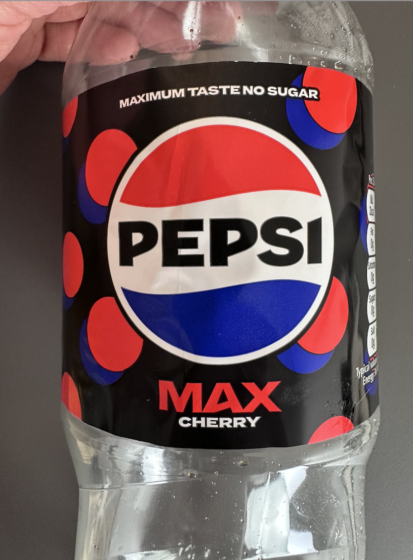
Pepsi:
How did you hold the bottle?
Hand over the label
What information from the label did you see first?
Green recycling logo followed by the volume
What did it take to find the name of the beverage? The ingredients? The nutritional information? The safety warnings (e.g alcohol consumption limits), if any?
Name of the beverage was the first thing seen and is very obvious
Label has a circular pattern which was eye catching
Nutritional information was on the side highlighted by green boxes showing 0% in fat, sugar etc, exaggerated to show the consumer
Squash:
How did you hold the bottle?
Picked up from the top and held sideways with hand over label
What information from the label did you see first?
‘Sun Quench’ logo followed by the fruit, implies it is ‘healthy’ as opposed to not
‘Double strength’ implies value for money for consumer
What did it take to find the name of the beverage? The ingredients? The nutritional information? The safety warnings (e.g alcohol consumption limits), if any?
Name is very obvious and is angled at the top in a curve downwards drawing consumers eye to the fruit
Nutrition label at the side is relatively easy to read but specifics are very small and almost hidden
Fanta:
How did you hold the bottle?
Hand over the front, at the side
What information from the label did you see first?
Fanta logo/green leaf, implies it’s healthier than what it really is
Orange illustration
What did it take to find the name of the beverage? The ingredients? The nutritional information? The safety warnings (e.g alcohol consumption limits), if any?
Nutritional information is very small, crowded by contact information and subtitles for competitions
Recycling logo, green stands out well with orange background
Frijj:
How did you hold the bottle?
Hand over the label
What information from the label did you see first?
Brownie illustration, meant to look indulgent
Frijj logo
What did it take to find the name of the beverage? The ingredients? The nutritional information? The safety warnings (e.g alcohol consumption limits), if any?
Nutritional information is very small and on the sides, would be covered up from how it’s picked up
‘Tear to aid recycling’ on label- non recyclable label
‘Consume within 3 days’ very small, almost not seen
Tropicana:
How did you hold the bottle?
At the top
What information from the label did you see first?
Orange illustration/image, implies health as opposed to sugar
Orange&mango text, then Tropicana brand
What did it take to find the name of the beverage? The ingredients? The nutritional information? The safety warnings (e.g alcohol consumption limits), if any?
Nutritional information is clear on the back
Branding is very clear with narrative on side of carton
Each sector of beverage’s packaging is slightly different and within each sector there are trends. Beginning with the fizzy ‘non healthy’ drinks such as Pepsi and Fanta. These 2 use solid colours covering their packaging, exaggerating their logos. They are well established brands, people do not go to them for health, but to indulge. They do not lean into the indulgence theme though, they divert attention to illustrations, stating how they are ‘no sugar’ or describe that they have the ‘best taste’. Both the cans and bottles use very bright colours to attract consumers attention.
The healthier sector of drinks such as juice and smoothies use photos, or almost surreal illustrations of their ingredients to exaggerate the health side of these drinks. Consumers are becoming more aware of the reality behind juices and smoothies and that consuming fruits as a liquid is not as healthy as they thought. These companies battle this by exaggerating the healthy feel to the packaging, using bright colours but not too garish and through brand narrative, such as Tropicana’s brand story on the side of the carton.
The polar opposite of this is Frijj. They lean into the indulgence of their drinks through solid colour illustrations exaggerating the drinks flavour. This tactic works very well, they also show that their parent company ‘Muller’ branding is clear on the front to imply quality product.
I really like the minimal, yet impactful design for a juice brand. The simple shapes used to represent the main flavour and ingredients for each bottle against the off white background is perfect for the target audience of a brand like this.
From my primary research I had the rough idea of the type of beverage I would like to create a design for- something within the healthier or energy drink sector. I continued my research, looking into various beverage brands including concept designs as shown in figures 1 and 2 designed by Matheus Ferreira.
This would appeal to a health-conscious audience, younger and has potential to become a trend within certain spaces, especially if promoted via social media. The brand posters are very strong and this is a great idea/way to add to a brand look book which I will consider when designing my beverage branding.
Shown in figure 4 is a brand concept for drinkable a healthy energy drink. I really like their almost retro style and use of their designs across multiple promotional materials such as a tote bag. The only issue here would be the longevity of the branding, is this a current trend? Would it last?
Rapscallion Soda (figure 11) really intrigued me, their branding looked like branding of medicine or something pharmaceutical. The colour choices were stylised and immediately convey ‘health’. The typefaces they use throughout their branding, and website layout are consistent with the message they aim to convey.
As opposed to Innocent, Huel (figure 13) uses a different branding tactic. Despite both of the drinks being considered healthy, Huel targets the ‘on the go’ or ‘work/gym’ sector of people and positions their branding accordingly. Their packaging appears healthy and inviting through their use of a minimal black and white paired with colourful images of fruit but almost medical like as it is served in a can and uses a more sharp sans serif typeface. These are elements to consider when designing my brand, who are the drinks for?
Red Bull (figure 15) is another drink in the ‘on the go’ sector. They really lean into the medical feeling by having bold, sharp graphics/colours and still leaving a lot of the classic silver can bare to see. This gives a more serious/medical feeling, almost as if you are consuming fuel.
I decided to move forwards with creating a design for ‘Goodrays’. I liked the idea of a challenging re-design for an already new company with effective branding. I began to research further into the company and compiled some mood boards including excerpts from their website and social media (figure 18, 19).
I then went onto brainstorming for my logo design (notes 4) and over all branding. I filled a page of paper with words associated to a few key words that Goodrays uses and represents: Fresh, High end, Accessible, Relax, Unwind, Natural, CBD, Fizzy, Nature. I expanded on these words to help develop visual ideas.
FIGURE 21:
Before sketching potential logos I wanted to decide on which packaging/bottle or can I would be using for the brand so I could keep this in mind when drafting ideas in hopes to keep all visuals/branding congruent with the values/keywords of Goodrays. I began my research and found some great can alternatives which interested me (figure 20, 21).
Goodrays aims to be a moment of relaxation/paradise for the active person. They currently use a can which makes sense as it is consumed in one go (can’t be resealed) this prevents the drink from tasting different or going warm etc as it is consumed in a small window of time. Cans are easily recycled which is great for the (most likely) environmentally conscious consumer, and they are small enough for the portion size to not be too large.
This concept designed by Veronika Kirilchuk is a great example of a more modern and stylised energy drink. I really liked the way they presented the brand guide, using different mock ups such as a carry packaging design and drinks coasters. I collated some of my favourites into one page to reference as shown in figure 3.
I continued to research brand concepts and also looked into brands that are established including new brands like Goodrays as shown in figure 5. I found Goodrays interesting because it is a new style of drink aimed to ‘relax and unwind’ and contains CBD. I liked the idea/challenge of re-branding an already new brand which includes and promotes often considered controversial ingredients such as CBD- perhaps this re-brand concept could be explored further.
FIGURE 12:
Innocent smoothies (figure 12) website and branding is great. The minimal design and colourful palette used paired with an inviting rounded typeface conveys a friendly feeling/healthy feeling for the viewer. The small more tactile looking elements such as the circling of what information you are about to click on only adds to this feeling.
Similarly to Innocent, Naked (figure 17) aims at the same crowd of people, but pushes the more health conscious side to their drinks. They include words such as ‘protein’ or ‘probiotics’ more boldly on their packaging and list their ingredients on a more minimal side of their overall busy label.
I made 2 spider diagrams brainstorming general ideas, information and context for the drinks brand such as who it is aimed at, what packaging would be most effective etc. I referred back to my research, in particular the primary research I had done, in order to get the sense of what works best for what feeling the brand intends to convey.
FIGURE 20:
Cans have a more medical/health/energy drink feel, which relates to the CBD element of their drinks, but they do not feel as premium. Goodrays are stocked at retailers such as Waitrose, which are more likely to have a customer looking for a premium product and be less price savvy. From researching, a metal bottle could be a good way to keep the health/CBD feel to the brand, re-useable for the active person and not need to be consumed in one go, recyclable and premium.
I collated a mood board (figure 22) of some inspiration for packaging. This was work by collage artist Bob Voigts, unrelated to anything commercial but when I was considering logo and branding his work came to mind and this style could be a fun way to differentiate the brand and still look premium (if designed in a way that’s not too tactile).
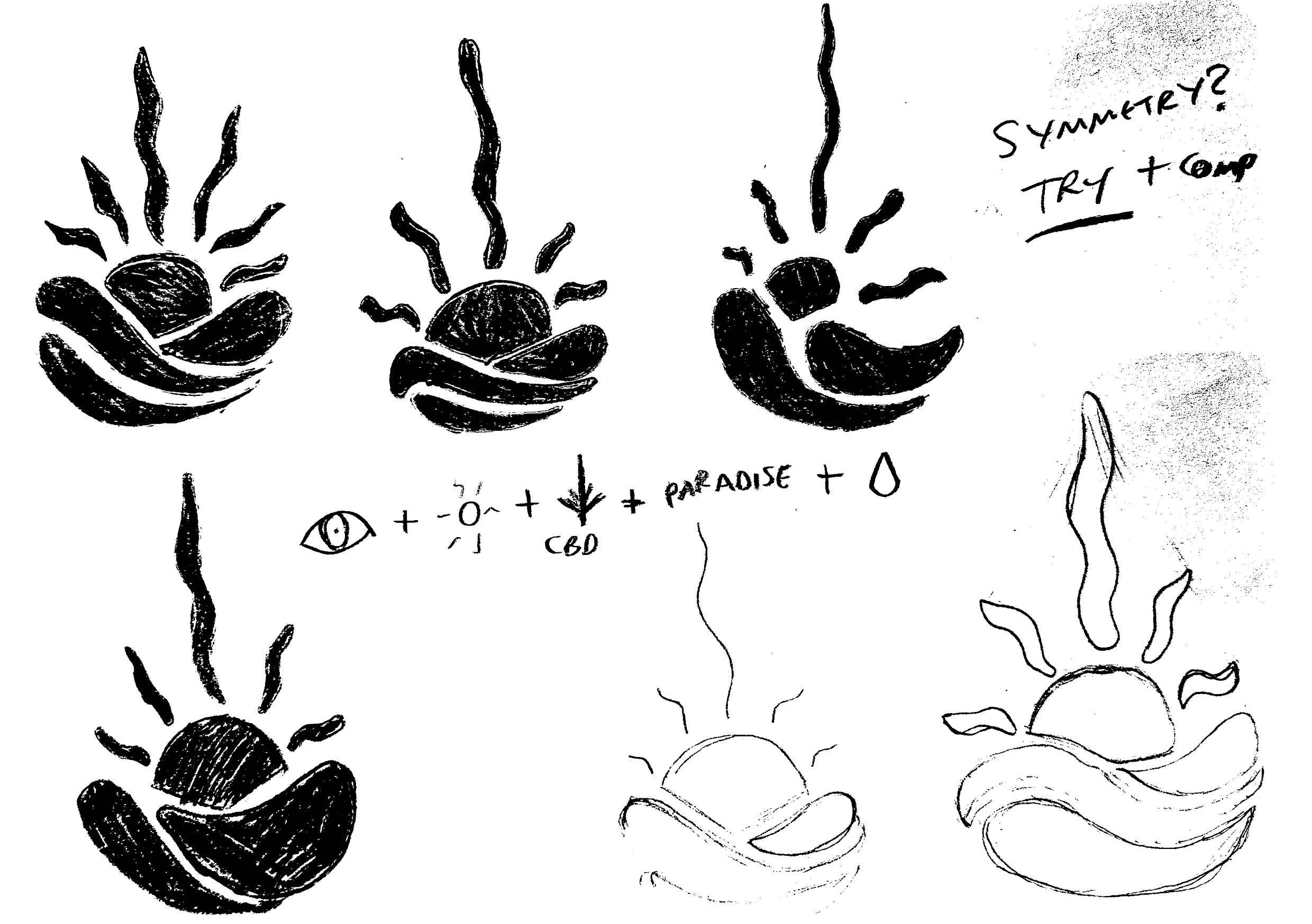
I quickly sketched various logo designs/visual cues, focusing on a few core visuals and ideas gained from my word brainstorming (notes 4). Through these sketches I came to the visuals of a water droplet, CBD plant, sun, sun rays, eye and path/mountain range and worked out a way to combine them. Despite the sun potentially making the consumer consider other company sectors such as holiday companies, Sun glasses, Heat appliances etc and not relating to a drinks brand I felt that this could work if used with the right colour palette.
The sun was intended to represent the unwind/paradise/relaxation feeling the consumer would have when consuming the product, it relates to the name ‘Goodrays’ being a sun/sunrays and the rays of the sun form the shape of a CBD leaf. The circular sun shape is intended to look like an eye. The overall visual is set within a water droplet, relating to the drinks brand and has a mountain range, path or river below it, adding to the paradise/relaxing landscape. I wanted the logo to represent Goodrays’ almost juxtaposing ideas of being premium, yet accessible by being minimal, premium but also having a slight ‘hippy’ type edge to it.
I began this design using a wider water droplet shape for the logo, eventually having to start again with a more stylised, thinner shape which I hoped appeared visually as more of a water droplet than my first design.
I developed varied colour palettes to experiment with when designing the logo, type and packaging in order to see what worked and what didn’t. With the idea of having 3 main drink flavours in mind I created varied palettes, mainly using pastel toned colours. The pastel tone has a premium feel to it and is appealing to the audience of 20-40 year old active people.
FIGURE 25:
Recently I have come across various designers via social media etc which have mentioned trying to integrate AI into your workflow, including image generation and virtual assistant chat bots, such as Chat GPT. I am familiar with image generators such as Midjourney but new to Chat GPT. I used this task as an opportunity to ask Chat GPT some questions. I began with asking it about the legal requirements for information on drinks packaging. Figure 25 shows it’s response.
I did not want to experiment further with packaging designs and the brand without having all of the information, so I don’t design in a silo.
I made some brief sketches planning various packaging layouts. I aim to create some maximal and minimal designs, then compare them. I have to keep in mind that this drink is meant to relax the consumer and try to represent this ‘moment of paradise’ feeling with the packagings aesthetic.
I moved forwards with the smaller can design, I felt that despite the smaller can often being used by the unhealthier drinks companies such as Pepsi and Fanta as shown in my primary research, that depending on the design it could feel more premium and less like an energy drink than goodrays’ current packaging.
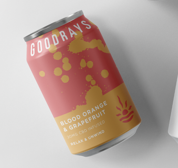
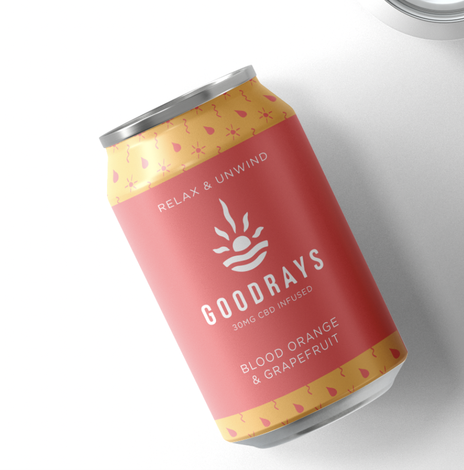
I worked through my sketch ideas, starting with copying the gradient style Goodrays currently uses. This was effective and looked calming, but was not very visually striking. I then experimented with various paint marks, aiming to represent water flow, but these looked too energetic and almost violent for a relaxing drinks brand. I tried to integrate the brand pattern within the can design but it looked too busy and again not on brand. The wavy line design including the orange and pink colour worked well but I felt that the white branding was not as obvious or recogniseable as a darker colour.
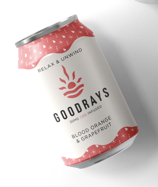
I experimented with a very dark blue, moving towards a dark grey/black. This colour paired with an off white background was more on brand and had a relaxed feel to it.
When designing the back label I referenced my primary research, perused the ingredients of Goodrays’ drinks and also what’s needed/what isn’t needed for packaging labels.
I worked on the idea in Illustrator, which again was a large learning curve for me. I am still new to building logos and playing around/working out the best ways to create shapes that are smooth and as simple as possible is time consuming. I learnt a lot about the shape builder tool and with adjusting line weights to achieve certain shapes with the help of a Youtube Series by Mohamed Achraf (figure 23).
I then moved onto type testing, comparing type to my logo and working out which typeface is best to move forwards with and begin to make my own. I decided that a sans serif or subtle serif typeface would work best for the brand, with an aim to convey a premium, modern product but not look too sterile or boring.
After various tests I ended up with using ‘Bebas Neue’ a commonly used typeface. I used a wide kerning with an aim to make the brand have a more premium feel. I edited the letters to have rounded edges, with an aim to make the type more inviting and relate to the rounded edges of the logo icon. I then made the ‘A’ have a rounded point at the top with a steeper gradient to appear more like the water droplet silhouette used for the logo icon, adding a water drop silhouette shape inside of it.
Puro ceramics (figure 24) is an Instagram page I came across by Fabio Bernardi a ceramicist based in Somerset. The abstract textures and lines that he creates within his work inspired ideas for the packaging and branding for Goodrays. The curved lines are more abstract but representative of the sunrays and movement of water.
I began to experiment with different mock ups to see which style of packaging and design could work best. I was still debating whether a bottle style was really better for the brand than a can. I debated whether a different shaped can than the ‘energy drink’ style packaging Goodrays currently uses such as a smaller wider can size would convey the ethos of the brand better and be a good ‘bridge’ between a bottle and a energy drink style can.
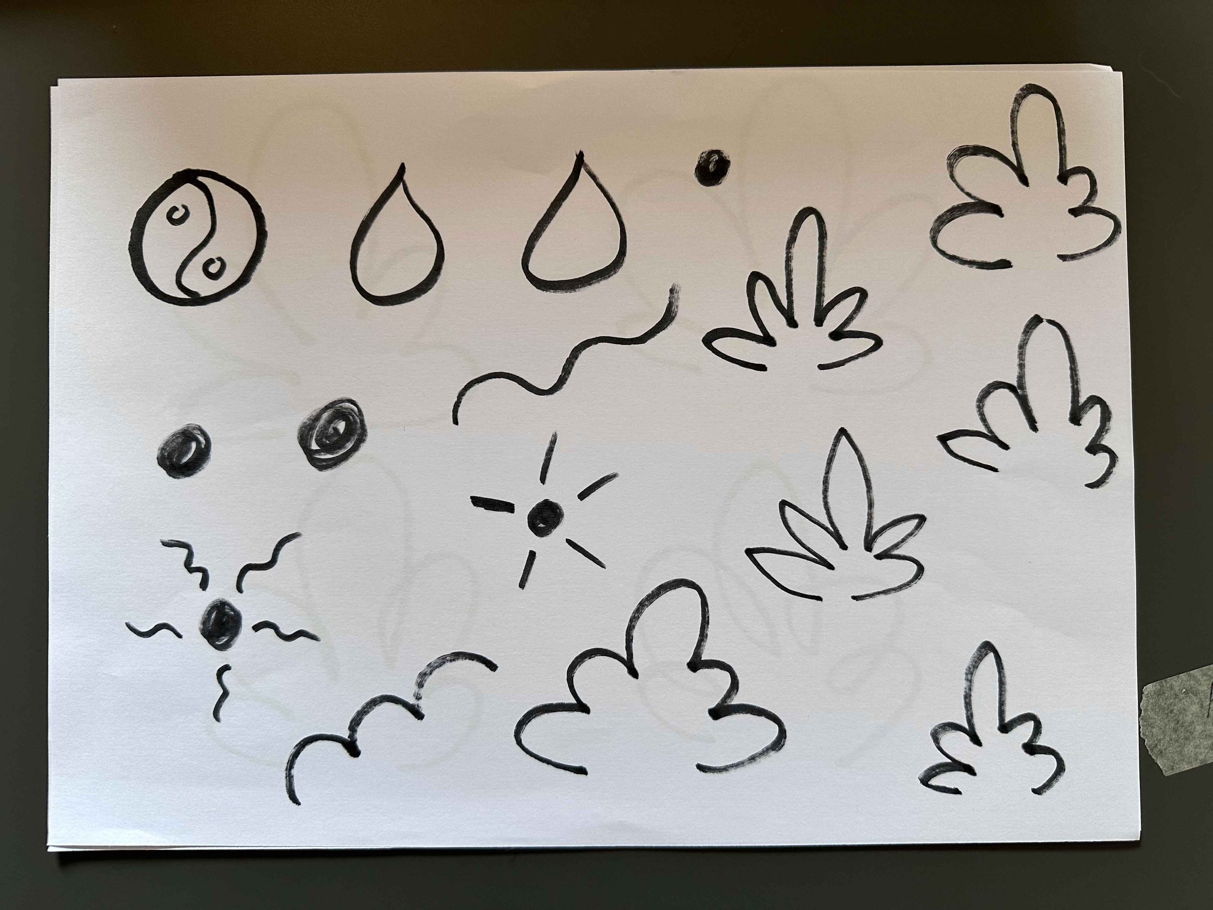
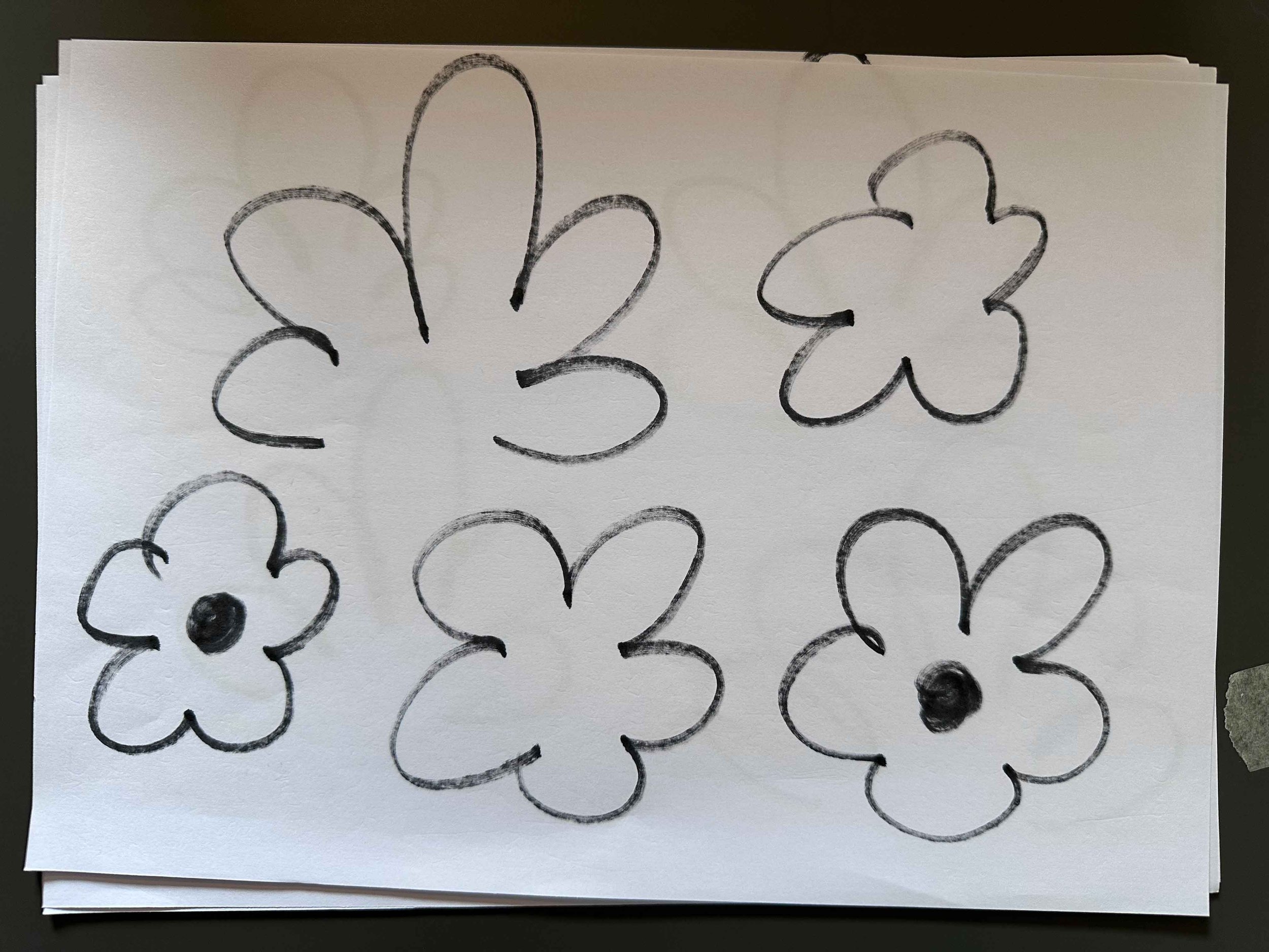
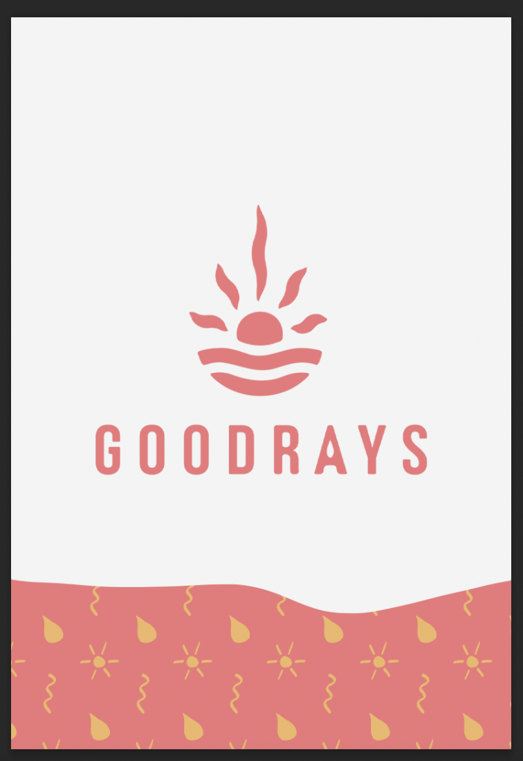
I continued to experiment with designing a brand pattern. I initially took elements directly from the logo and composed a pattern, this was not effective and the letters would not interact well on packaging next to other written information. I then hand drew some icons related to the ethos of the brand in a playful style, scanned them in and edited them. I tried to encapsulate the CBD element of the drinks in a non-obvious way as this could be off putting for many customers if a drink was covered in cannabis leaves for example. I boiled down the shape to a curly wave line, representing leaves/strands and also the flow of water or winding paths.
I paired my typeface with a rounded Gotham typeface in a lighter weight. I felt that this worked well with the logo and had a more calming, relaxing feel to it. I chose to use capitalised letters throughout the branding as this gave it a more premium, professional feel.
The final can can design I felt worked well as the wavy colours at the top and the bottom work well with and relate to the ‘sunrays’ and Goodrays’ brand, representing water moving, sunrays, pathways, mountains etc. I like the brand pattern and feel that this could have been integrated further into the brand, but feel that it works well for the box design.
Overall this task was challenging, but a fun and different. Again as with this task I was shown how much I need to practise with logo designing in Illustrator. I struggled a fair amount to translate my ideas into vector form, but got there eventually. I really enjoy the process of logo design and creating this logo but looking back I am still unsure if this logos
the most appropriate for a drinks brand. The concept behind it makes sense but does the obvious sun visual in the shape of a water drop really convey the sense of a drinks brand? I am unsure if the water droplet shape is enough for this to come across as the ‘moment of paradise’ feeling the brand is intended to convey. Perhaps with more time I could’ve produced further logo iterations as opposed to jumping forwards with the concept I felt worked best. This would also be a good stage to get external feedback as this is what matters the most.
I feel as if the packaging design works and has a calming, minimal feel to it which represents the brand well, but I feel as if the final design lacks in being visually interesting. If this can was next to others in a supermarket, it wouldn’t really stand out. Looking back, perhaps other iterations of the packaging design had more potential and could’ve been explored further. The orange and pink wavy design is more visually interesting and could’ve been experimented with further.
Resources:
Figure 1: Concept Juicy brand and packaging by Matheus Ferreira (2022) World Brand Design Society. Available at: https://worldbranddesign.com/concept-juicy-brand-and-packaging-by-matheus-ferreira/ (Accessed: 14 May 2024).
Figure 2: Concept Juicy brand and packaging by Matheus Ferreira (2022) World Brand Design Society. Available at: https://worldbranddesign.com/concept-juicy-brand-and-packaging-by-matheus-ferreira/ (Accessed: 14 May 2024).
Figure 3: Behance (no date) Behance.net. Available at: https://www.behance.net/gallery/196687023/Brand-Identity-Package-OASIA?tracking_source=search_projects_recommended|beverage+brand&l=6 (Accessed: 14 May 2024).
Figure 4: Behance (no date) Behance.net. Available at: https://www.behance.net/gallery/196725127/Drinkable?tracking_source=search_projects|drink+branding&l=19 (Accessed: 14 May 2024).
Figure 5: Goodrays — (no date) Owen Tozer. Available at: https://www.owentozer.co.uk/design/goodrays (Accessed: 14 May 2024).
Figure 6: Beer packaging design: Creative and stylish (no date) Pinterest. Available at: https://www.pinterest.co.uk/pin/211174976172733/ (Accessed: 14 May 2024).
Figure 7: Strange Folks (no date) Dribbble. Available at: https://dribbble.com/shots/4597694-Strange-Folks-Gorillaz-Concert-Beer-Can?utm_source=pinterest&utm_campaign=pinterest_shot&utm_content=Strange+Folks+%7C+Gorillaz+Concert+Beer+Can&utm_medium=Social_Share (Accessed: 14 May 2024).
Figure 8: Gordon, C. (2022) OMNISM presents sugar differently on its RTD cocktail cans, DIELINE. Available at: https://thedieline.com/omnism/ (Accessed: 14 May 2024).
Figure 9: Pinimg.com. (no date) Available at: https://i.pinimg.com/originals/bb/7f/23/bb7f230da4be2ce217e704f6f4e90798.jpg (Accessed: 14 May 2024).
Figure 10: Special One (no date) Packagingoftheworld.com. Available at: https://packagingoftheworld.com/2021/05/special-one.html (Accessed: 14 May 2024).
Figure 11: Fresh fruit soda (no date) RAPSCALLION_SODA. Available at: https://rapscallionsoda.com/collections/d2c (Accessed: 14 May 2024).
Figure 12: Home (no date) Innocentdrinks.co.uk. Available at: https://www.innocentdrinks.co.uk/home (Accessed: 14 May 2024).
Figure 13: Huel (no date) Huel. Available at: https://uk.huel.com/ (Accessed: 14 May 2024).
Figure 14: Neutonic: Fuel your focus and supercharge your productivity (no date) Neutonic. Available at: https://www.neutonic.com/ (Accessed: 14 May 2024).
Figure 15: Red Bull Energy Drink (no date) Redbull.com. Available at: https://www.redbull.com/gb-en/energydrink (Accessed: 14 May 2024).
Figure 16: Master, W. (2021) Water in A box. Available at: https://www.waterinabox.co.uk/ (Accessed: 14 May 2024).
Figure 17: Meet The Family (no date) Nakedjuice.com. Available at: https://www.nakedjuice.com/our-products/ (Accessed: 14 May 2024).
Figure 18: Goodrays (no date) Instagram. Available at: https://www.instagram.com/goodrays/?hl=en (Accessed: 14 May 2024).
Figure 19: Goodrays (no date) Instagram. Available at: https://www.instagram.com/goodrays/?hl=en (Accessed: 14 May 2024).
Figure 20: League Digital (no date) Trivium packaging, Triviumpackaging.com. Available at: https://www.triviumpackaging.com/products/industry/beverages/ (Accessed: 15 May 2024).
Figure 21: You searched for cans (no date) Ampulla LTD. Available at: https://www.ampulla.co.uk/?s=cans&post_type=product (Accessed: 15 May 2024).
Figure 22: Robert Voigts (no date) Instagram. Available at: https://www.instagram.com/bobvoigts/?hl=en (Accessed: 15 May 2024).
Figure 23: Achraf, M. (2017) The shape builder tool | Adobe Illustrator Quick Tips & Tricks #3. Youtube. Available at: https://www.youtube.com/watch?v=RTnT-PDPp7g&list=RDCMUCF6WjcZeVqy3MLBpp86eOyw (Accessed: 15 May 2024).
Figure 24: Puroceramics (no date) Instagram. Available at: https://www.instagram.com/puroceramics/ (Accessed: 15 May 2024).
Figure 25: Chat GPT response 16/5/24.
Figure 26: Goodrays (No date) Tesco.com. Available at: https://www.tesco.com/groceries/en-GB/products/312706339 (Accessed: 16 May 2024).
Figure 27: Food labelling (no date) British Nutrition Foundation. Available at: https://www.nutrition.org.uk/creating-a-healthy-diet/food-labelling/ (Accessed: 26 May 2024).


