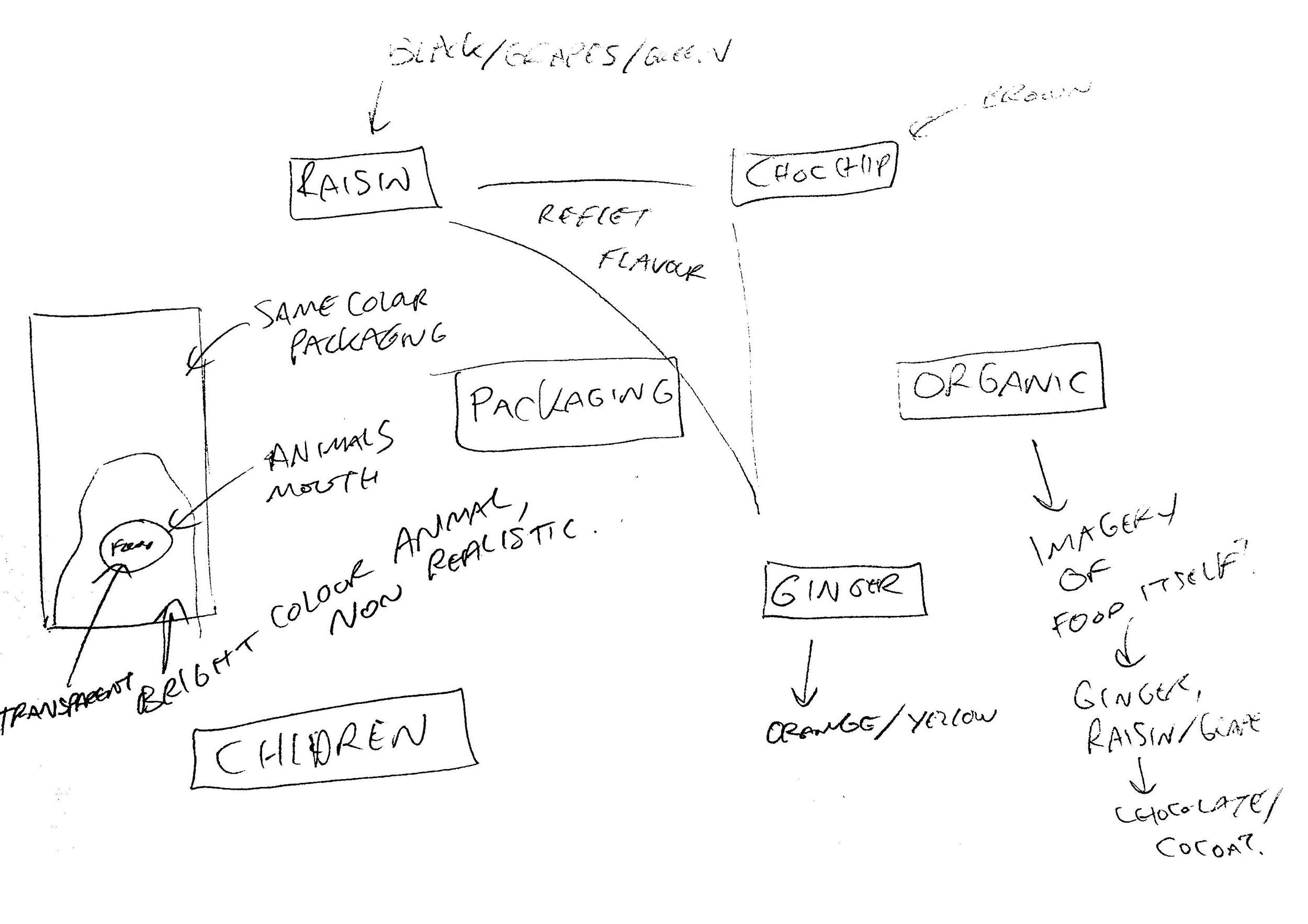
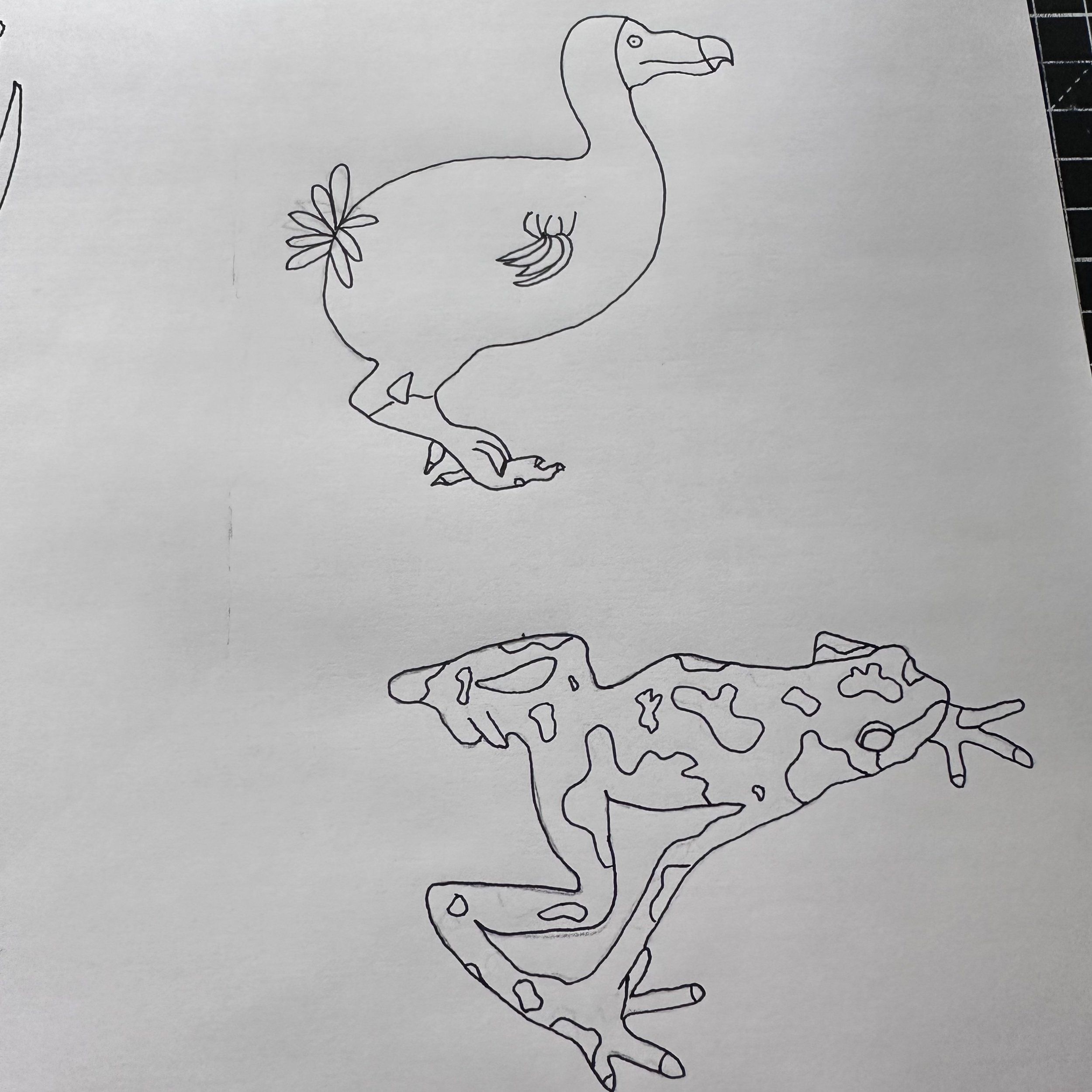
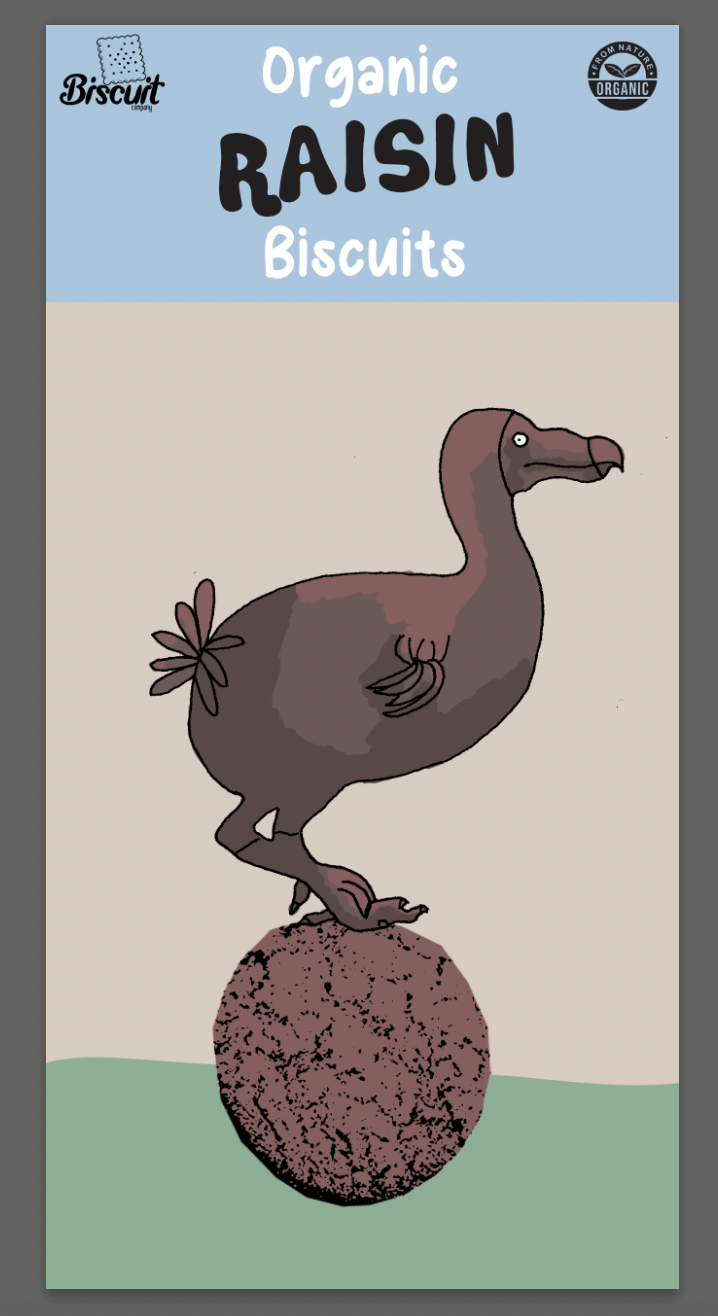
Illustration 1: Key steps in illustration- Part 5: Words and pictures-Exercise 5: Packaging
Produce a series of illustrations for packaging to be used for a new range of organic biscuits for children. There are three varieties in the range Raisin, Choc Chip and Ginger biscuits. The client specifically wants three illustrations featuring extinct animals interacting in some fun way with a biscuit to be used on the boxes. The drawings should be in full colour, and the client would like the colours to reflect the ‘flavour’ of the biscuit.
Go to the shops and research the market. How will you stand out amongst the others?
As it will probably be an adult who makes the purchase, you need to decide whether you will exploit ‘pester power’ or appeal to both adult and child. You may want to develop characters suitable for young children or employ a style of drawing to appeal to your all your audiences. You also need to decide whether you will have hand-drawn or ‘straight’ typography.
You need to submit all stages of the development process – thumbnails, visuals for all three designs and a mock-up for at least one.
I noted key points to the brief such as the flavours, organic, and colouring of packaging. During research I added other elements that I thought would be important such as the character interacting with the product/packaging.
I looked at various children’s biscuits and other foods, collating some of my favourite packaging, each for different reasons. The ‘Ellas Kitchen’ was one that stood out to me in particular because of the bold block colours and hand made type. I also really liked how ‘The Natural Confectionary Co’ had its characters mouths open with a transparent part of the packaging showing the product inside.
From this research it consolidated that I would go for a playful packaging, aimed to attract the eyes of children, but try to appeal to adults with possibly including imagery of organic elements/ingredients, conveying this obviously to the potential buyer.
I researched packaging/boxes and found a suitable mock up to use. This also gave me the canvas for my design, a sizing I hadn’t worked with before, a more narrow and long shape. I drew some thumbnails collating my ideas from my research so far. I also looked at suitable typefaces, downloading new ones, particularly inspired by Ellas Kitchen logo.
Referring to my thumbnails I experimented with compositions of the animals interacting with the biscuits and front of the biscuit packet. I continued to produce more hand drawn elements adding them in and changing the texture of the illustration.
Before looking at compositions/colours etc I wanted to confirm the 3 extinct animals I will use for the designs. I looked through lists of extinct animals but kept coming back to common ones and thought that this would probably be best as they would be easily recognised by adults/parents. I also kept in mind which could look good as an illustration that was appealing/fun to children. Possibly the more fantastical the animal the better- Mammoth, Sabre Tooth tiger.
I sketched my 3 chosen animals going over them in a thin black pen. I wanted them to be clear/eye catching and also each with different qualities. I chose the Dodo, Mammoth and a Chiriqui harlequin frog.
I wanted the animals to represent the flavours of the biscuits they will be on the front of, the mammoth for chocolate, frog for ginger and dodo for raisin.
MOCK UP 1
I feel like my final results are an interesting response to the brief. I aimed to keep the packaging appealing to parents but still fun for children.
I wanted my characters to interact with the elements on the page and be visually interesting to draw the viewers eye across the packaging to different parts/information. In the end I went with a hand drawn biscuit instead of my initially planned ‘transparent’ part showing the biscuits inside the packet as I felt it worked better/was more cohesive across each illustration. The simple black line illustration was targeted at children with an aim to look as tactile as possible yet remain visually appealing and not become too abstract.
When comparing my mock ups to the inspiration I had collated, in particular ‘Ellas Kitchen’ there are elements that have worked, inspired directly from them such as the landscape/green hill. This was a feature throughout various designs I had made mood boards from and something that I felt was easily recognisable and would almost make the adult feel ‘safe’ in buying the biscuits as it is something they see regularly/with brands they are familiar with.


