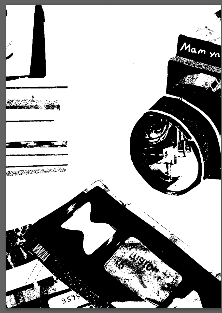
Illustration 1: Key steps in illustration- Part 5: Words and pictures-Exercise 1: Your own work
Most of the work you’ve created so far has been as a result of specific exercises with clear objectives defining the outcome. However, every drawing, every mark, every image you produce belongs to you and, as your property, has a potential value beyond the satisfying of a brief or exercise.
Go through the artwork you’ve created so far for this course. Review your sketchbooks, notebooks, working drawings and sketches as well as the more ‘resolved’ or finished pieces. Use post-it notes to identify the images which have elements that you enjoy. Try to distance yourself from each image’s original function, and its success as measured against your original intentions and goals, and make your selection purely on whether you enjoy the image aesthetically or conceptually. Photocopy or scan a selection from these images to make a ‘gallery’ of pictures, fragments of illustrations and drawings.
Choose from one of the areas of authorial practice and select an image from your gallery that would be appropriate for that area. Remember that you also need to identify an audience for your work within the area you’ve chosen.
If you can, implement the choices you’ve made and actually produce the artefact. There are many companies on the high street and on the internet offering services to help you transform your imagery into commercially viable or appealing objects. If you choose to implement your design be aware of the cost implications and investigate at least three alternative suppliers before committing yourself to a particular supplier.
I quite liked the idea of producing a zine from my work and re-editing/working these images to produce something mono-colour/easier to screen print or choosing a more limited palette for printing- creating a narrative between the work. This would mean that I wouldn’t choose a singular image, but all or some of the above in order to make my zine.
My first task here was identifying an audience. I made notes of people who would potentially be interested in a zine of this style and began to consider a theme/narrative and what could bring the content of the zine together.
Focusing on an audience interested in a grunge aesthetic it reminded me of artist Lucas Geida who creates mixed media work and occasionally books/zines. This book interested me as it was purely textures created from various inks, oils and water.
I looked through my work throughout this section and selected the elements that I liked, or had parts of them that I liked aesthetically/conceptually. I made brief notes as to why each image was chosen. This helped me hone in on my favourite elements from each and further gather an idea of the direction I would like to take my illustration style in.
I particularly like the aesthetic of limited colour palettes and more abstract markings/imagery. I also like the use of physically edited/produced typography.
I went onto researching and collating inspiration for my zine, including various found images and old screenshots. I wanted to move forwards with a mono-colour maybe a blue or in black and white, with this in mind I looked at various imagery for inspiration on composition and typography.
I continued with experimenting, editing compositions and combining some images. This allowed me to develop a narrative surrounding the word ‘nervous’. I worked with this word in mind when seeing my layout in Indesign.
As my chosen images were all for different tasks/had different conceptual goals I aimed to bring them together aesthetically. This zine by Geida was inspiration aesthetically for me. I went onto looking through my images and testing them in black and white. I also experimented with some of their compositions, sizes and adding or subtracting elements. I had to consider how they would look side by side and what would pair well together. I referred back to my initial layout, testing this composition now the images had been edited.
I feel like my final zine was quite affective in combining my previous works and could potentially be attractive to an audience interested in this style/aesthetic.
Over time the narrative around ‘nervous’ arose and I worked with it, editing, combining and creating extra elements to the images. I feel like most of the images when viewed in this way can convey a stressed or nervous feel- some more than others. I combined certain images that I felt worked well aesthetically and with the concept, for example the bottom middle double spread. In this the 2 black ripped elements combine over the double spread and the type on each sides balances it.
I feel like my most affective image was the spread on the top right row (pages 3/4). I combined a previous image with the type from another. The synergy of the images worked well as they had similar narratives/conveyed the same thing.
There are many elements that I would change/work on further looking back. I could experiment further with the physical pages, similarly to Geida and use different materials that could relate to the theme further. The images themselves could be worked further, again to exaggerate the sense of ‘nervousness’.


