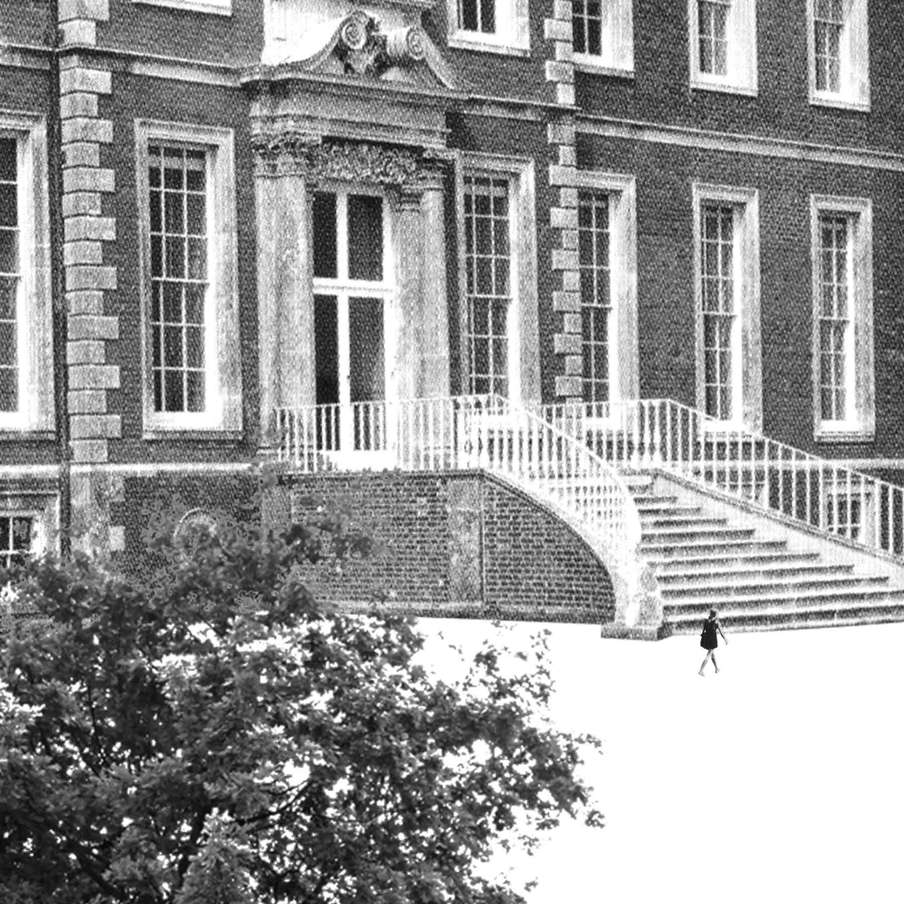
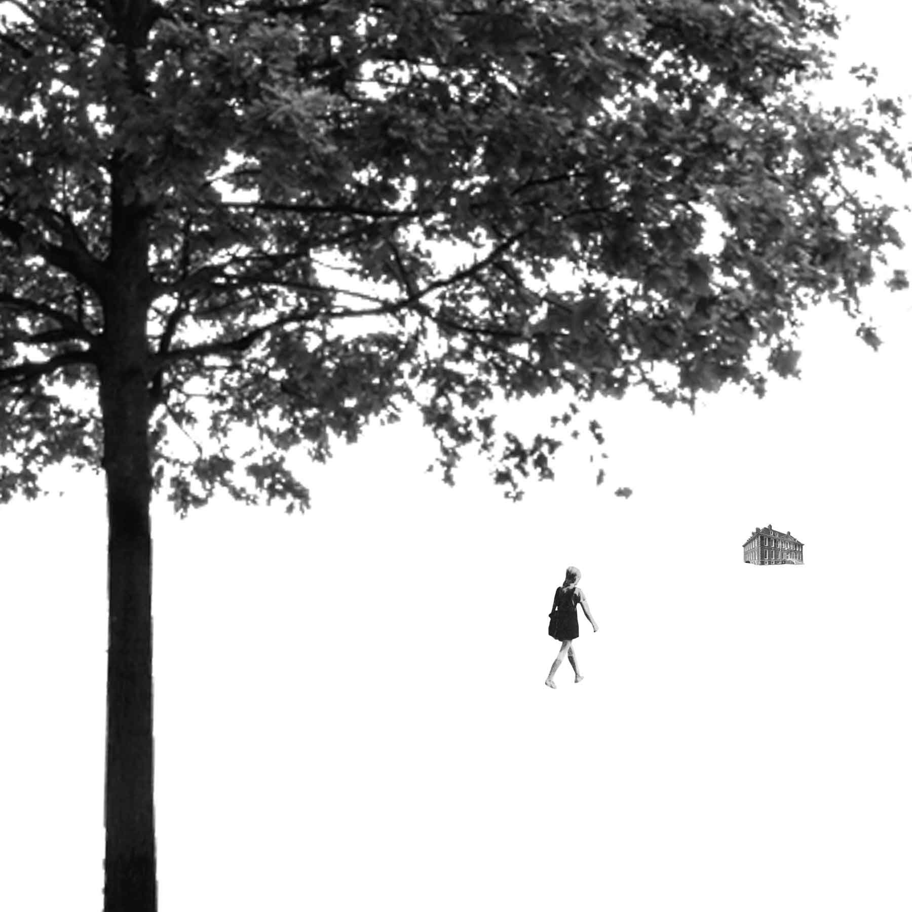
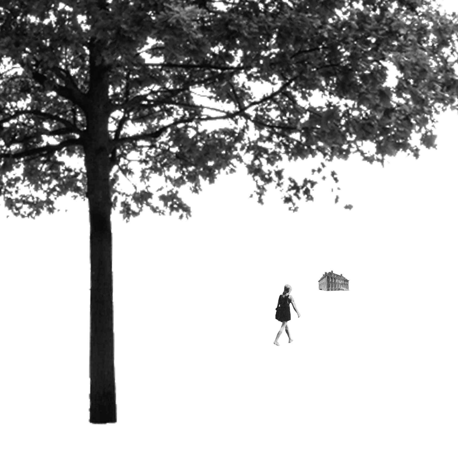
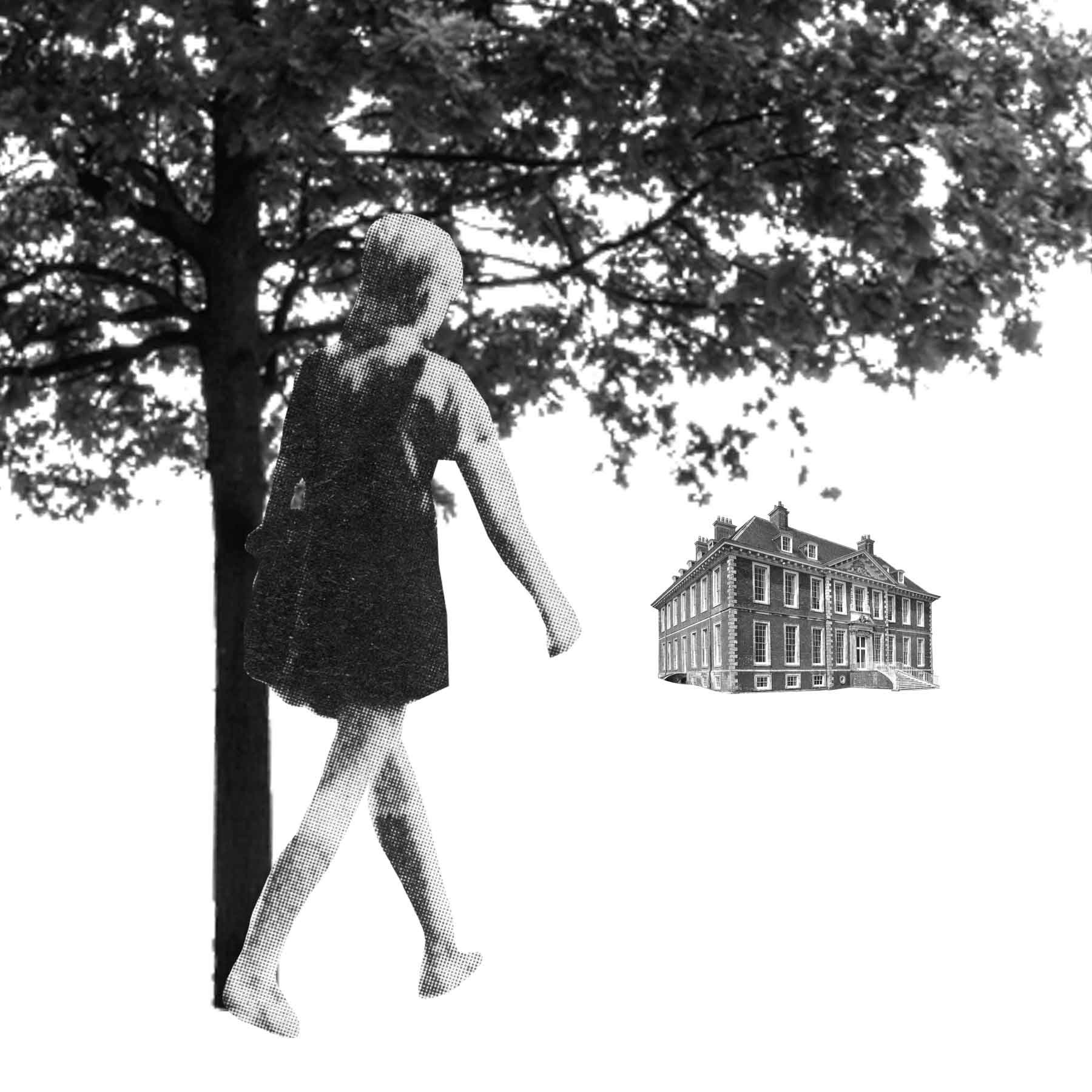
Illustration 1: Key steps in illustration- Part 3: Working it out-Exercise 1: Illustrating visual space
Using internet searches or your own visual references select an image of each of these:
A tree
A child running or walking
A building
Photocopy them in black and white at different scales and sizes so that you have several versions of each image. Cut them into individual items with which to work.
Scan and print or photocopy these designs or do a quick trace of each design so that you can compare the visual impact of one with another. Then in your learning log make notes in answer to these questions:
How does your sense of the image and its meaning change when the figure is smaller than the other elements?
If the elements are at differing angles to each other and at an angle to the frame, what dynamic is suggested?
If all the elements are completely horizontal and vertical in relation to the frame what dynamic is suggested? What is your opinion about this image and what sensation does it communicate?
Which is your favourite composition? Explain why you feel it is most successful.
Grandfield’s work is very dynamic and bold. The black silhouettes of important elements or shadows contrast from and interact with the pastel/primary colours used and form interesting scenes. The lines and shapes are very suggestive and immerse the viewer into the image. I particularly like the green hillside landscape above, you can almost feel the wind suggested by the shapes of the lines and movement of the character/tree.
After initially cutting out the images physically I re scanned them and adjusted the scale in Photoshop. This allowed me to produce a wider range of examples. I began using scale ‘normally’ then ventured into the more abstract and obscure.
I began this task by looking into some of the work by the suggested designer Geoff Grandfield. I found the black and white image shown as an example very compelling and wanted to see more. I created a couple of mood boards of his work to refer to.
Grandfield’s Instagram was also very interesting, he documented interesting iconography, lines and textures. I found this inspiring and took some screenshots.
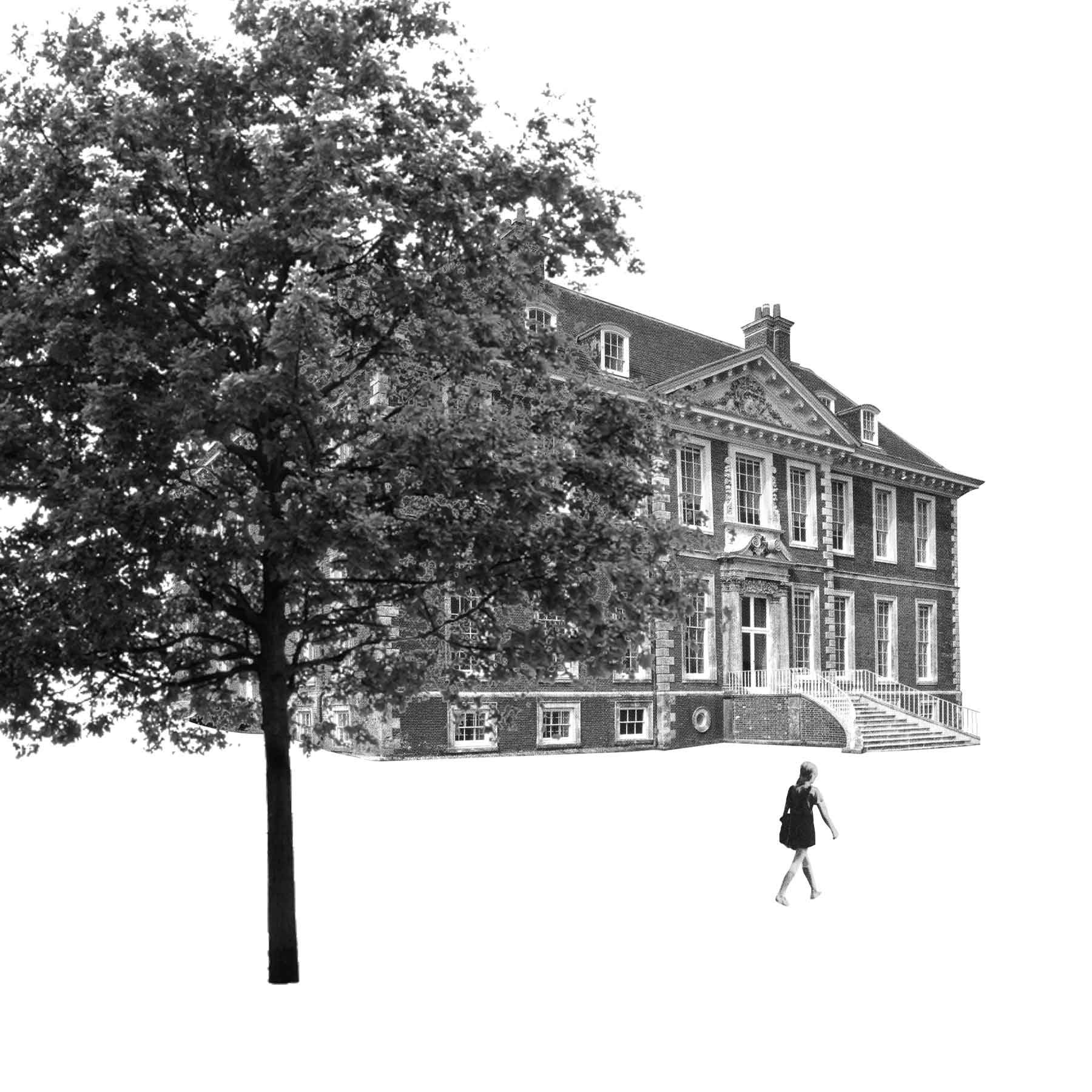
I went onto finding my 3 elements; building, tree, walking/running child. I found the building and child from previous works/scanned images and the tree from an internet search. I made the images black and white and printed them to begin experimenting.
The overall feel of the image is changed depending upon the size of the child figure. If all other elements remain the same but the child is smaller this may give the affect of distance or feeling scared/small and creates a narrative of negativity between the child figure and the building. It makes the viewer ask questions such as ‘does the child want to be there?’ ‘What happened there?’ etc. When the child is larger is can create the illusion of them being closer to the viewer and further from the building. The larger the child the less daunting the building appears.
The angle of the image also affects the emotions conveyed by it to the viewer. The corner to corner more obscure angle of the building with the child walking towards it gives it an eerie feel and appears like a still from a horror film. All elements appearing vertically has the opposite affect, leaving the viewer feeling fine as if it is a ‘normal’ image or interaction between the child figure and the building. If the images are horizontal the image again feels eerie but in a more dramatic sense. Comparing this to a film still it appears more like it is from a thriller/action scene.
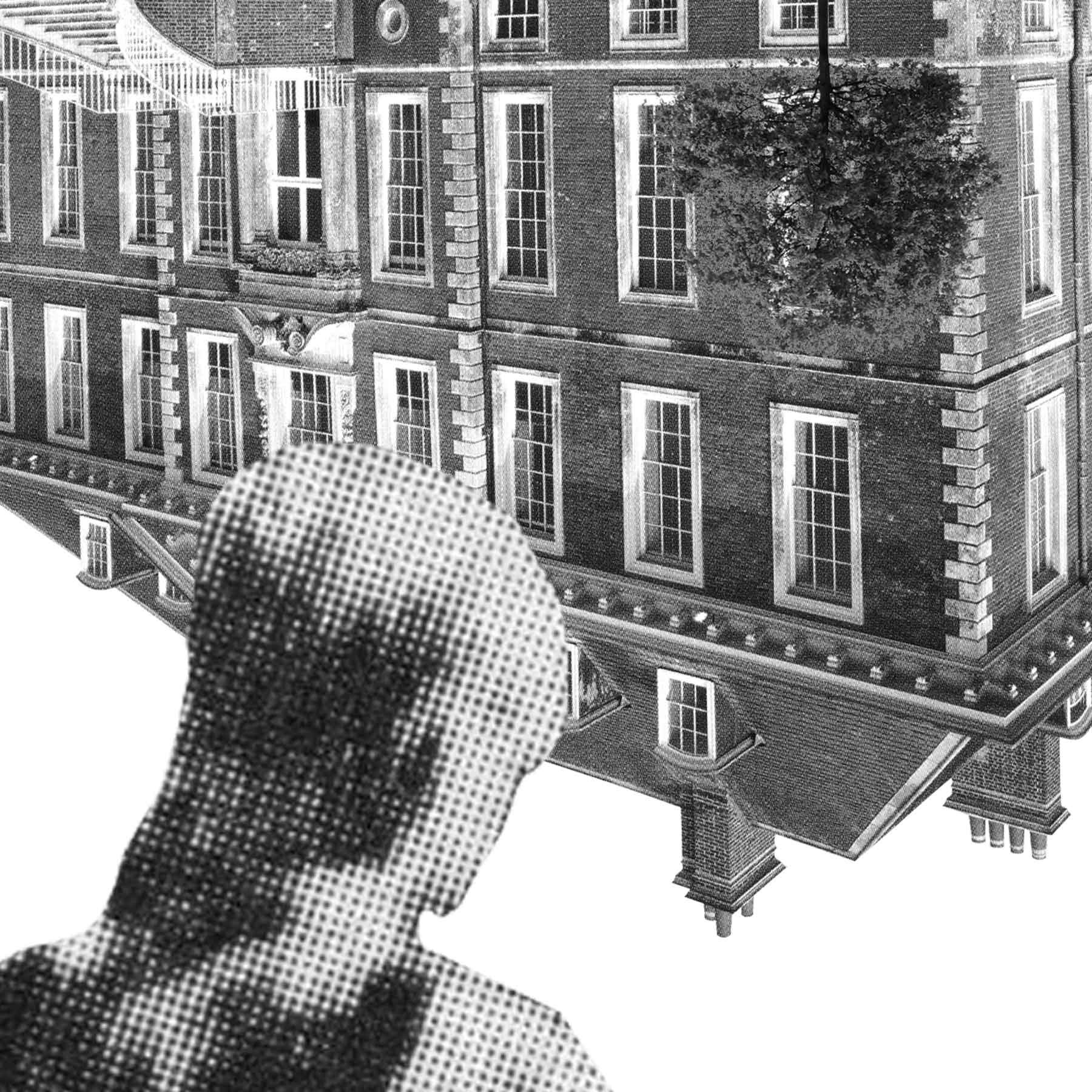
I found this task very interesting. Arranging the elements in different ways immediately made me go back and review Grandfield’s work which initially appears ‘simple’ but is masterfully so, creating exactly the ‘correct’ emotion for the viewer. Some of the visuals I created more ‘randomly’ I felt were quite affective, especially after tweeking them to look more visually pleasing. Below are my 3 favourites.
The first image (on the left) I quite like the obscure angle of it. It creates a stressful image and is interesting visually, it allows the viewer to ask questions. The second with the upside down imagery is a different angle, close up to the figure walking towards the building. The simple upside down evokes lot’s of questions and potential feelings of the character- a literal ‘upside down’ feeling, confusion, scared etc. The final image of just the upside down building I liked because it is a close up of the figures head, a look into their mind or feelings and the building again represents the ‘upside down’ emotion or confusion.
I have really enjoyed this task and it has inspired me to experiment with a different style of illustration moving forwards, especially when there is a chance to create a visual including a figure etc. I will continue to test in this way in the future, perhaps initially limiting myself to a few elements and adding mark making and textures afterwards.


