Creative Book Design- Part Three: Text, image and typography-Exercise 3: Experimental typography
Below is an extract from Jules Verne’s 20,000 Leagues Under the Sea. Using a single typeface of your choice, lay out the text in as inventive a way as possible. Experiment with the letters and words, using the typographic principles you researched in earlier exercises to significantly alter the arrangement of the text, its rhythm and readability.
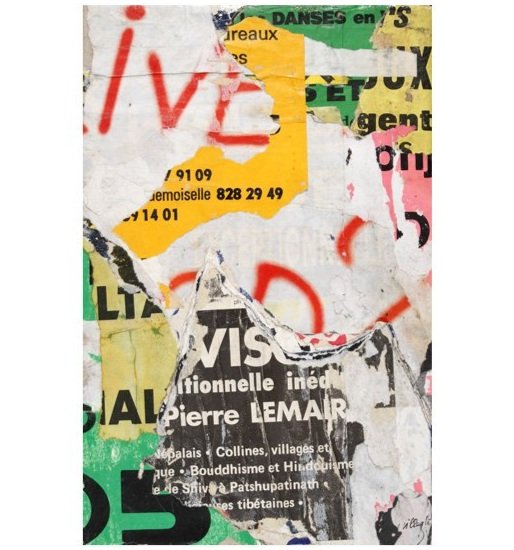
Jaques Villegle’s work is very inspiring. I hadn’t heard of Villegle before, but his work reminded me of that of Mimmo Rotella. After some brief research I found that they were both from the same era, which is interesting.
The tactile feel is very emotive, the use of found posters/ripped textured paper creates work that is very strong visually. I particularly like the use of the ripped red spray painted text in the work on the right of the mood board. This will be something I will have to explore further.
Alan Kitching was recommended to me to look into by my tutor. Kitching’s work is great. He uses screen-printing and other tactile processes to create textures that are individual and intriguing.
I particularly like the close up on the bottom left showing the edges of the ‘B’. The subtle distressing/screen-printed look is very sophisticated. Kitching’s use of colour is something I hadn’t seen before. Kitching must use small amounts of each colour when screen-printing, allowing the layers to be ‘random’ and create a painting within the type.
I began this exercise by jotting down any key words from the brief, followed by some potential designers/artists to reference for inspiration. I then noted some potentially suitable typefaces listed by Derek Birdsall in ‘Notes on book design.’
After reading through the extract I went back through it and noted words that stood out to me by either representing imagery/emotions etc. I then did some brief research about the book as I haven’t read it before. I then noted some colours that came to mind which could potentially represent the extract well.
Armand Brac is a French living artist who works with a mixture of mediums, textures and colours to create his abstract expressionist art. When viewing Villegle’s work it reminded me of Brac, who In found via Instagram a long time ago. It took me a while to remember his name, but I am very pleased to of returned to his work. The fluidity and motion of Brac’s work serves as great inspiration for this task as the extract is about/could be and represents exploration, movement and the unknown.
I wanted to include texture and colour that could represent the section of text given. I decided upon blue, brown and orange. Blue being the sea and the unknown. Brown being the movement towards the goal (exploration) due to it being a dull, lesser obvious colour, and orange to represent the ‘enormous thing’.
I intended to create these visuals using a combination of physical and digital techniques. I haven’t tested with acetate and scanning different elements before and this task felt like a good opportunity to do so. I chose to initially focus on the typeface Gill Sans, inspired by Derek Birdsall in the previous research task. I feel like a sans serif typeface visually is the best when distressed and damaged etc (something I intended to do). The use of a sans serif typeface was also inspired by Alan Kitching’s typography work.
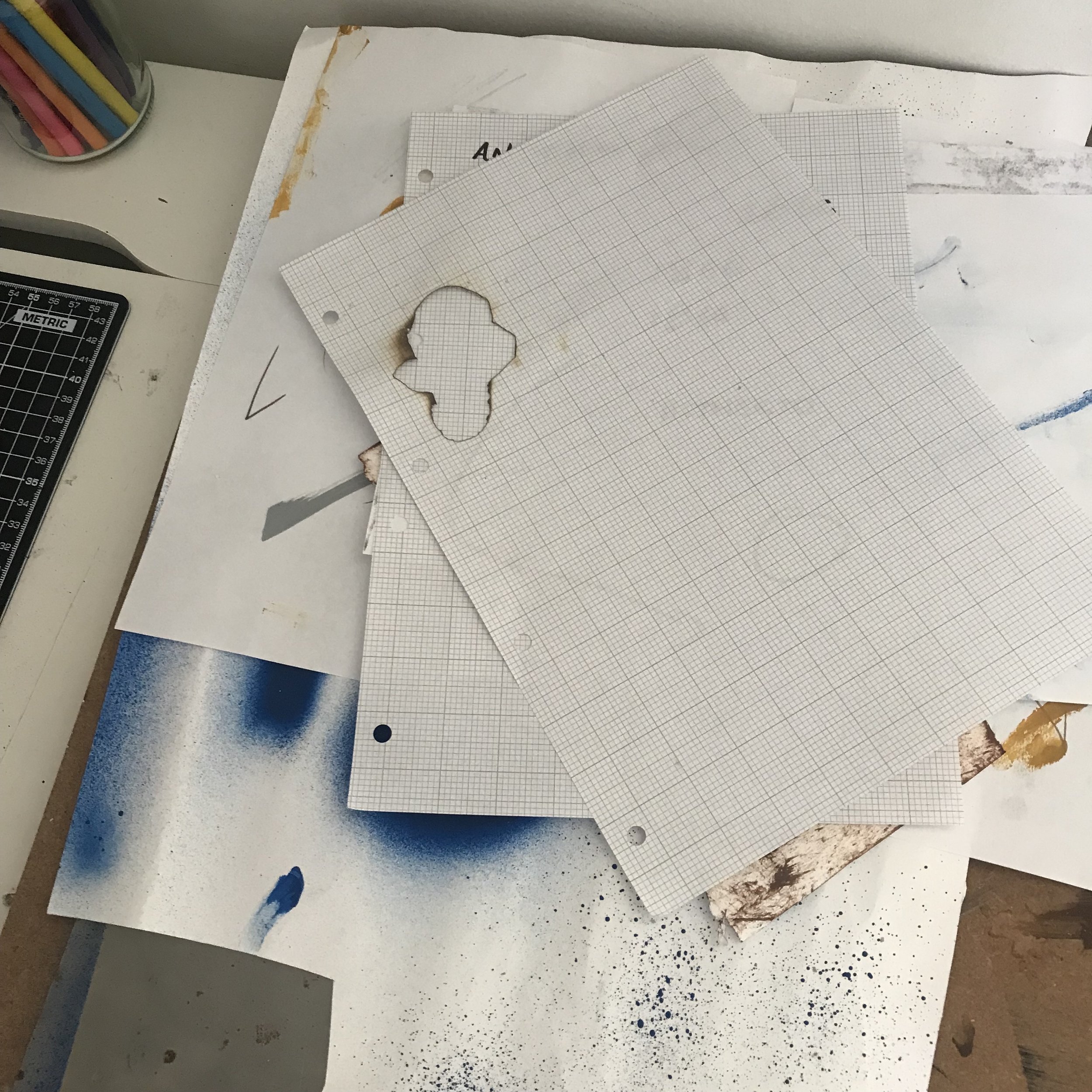
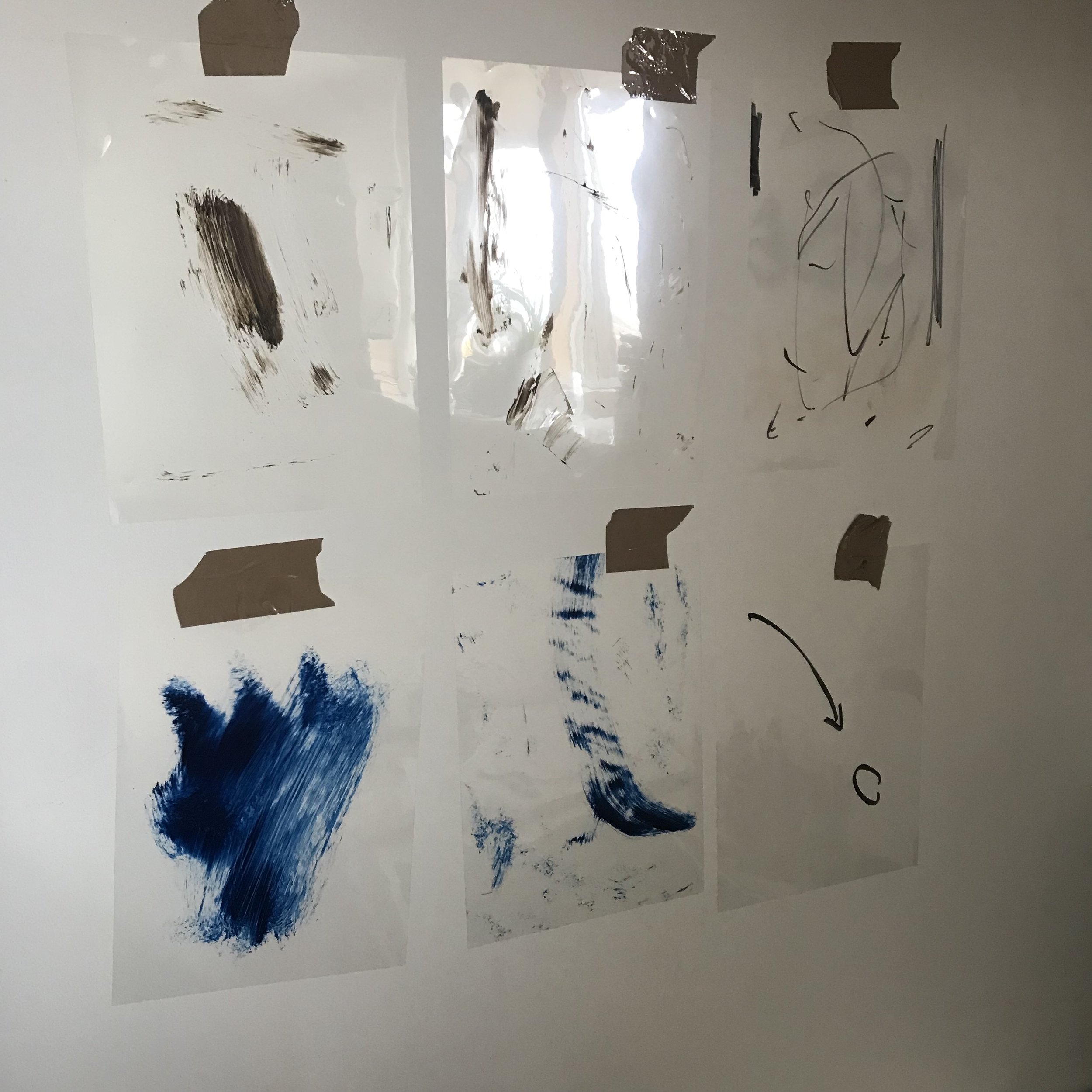
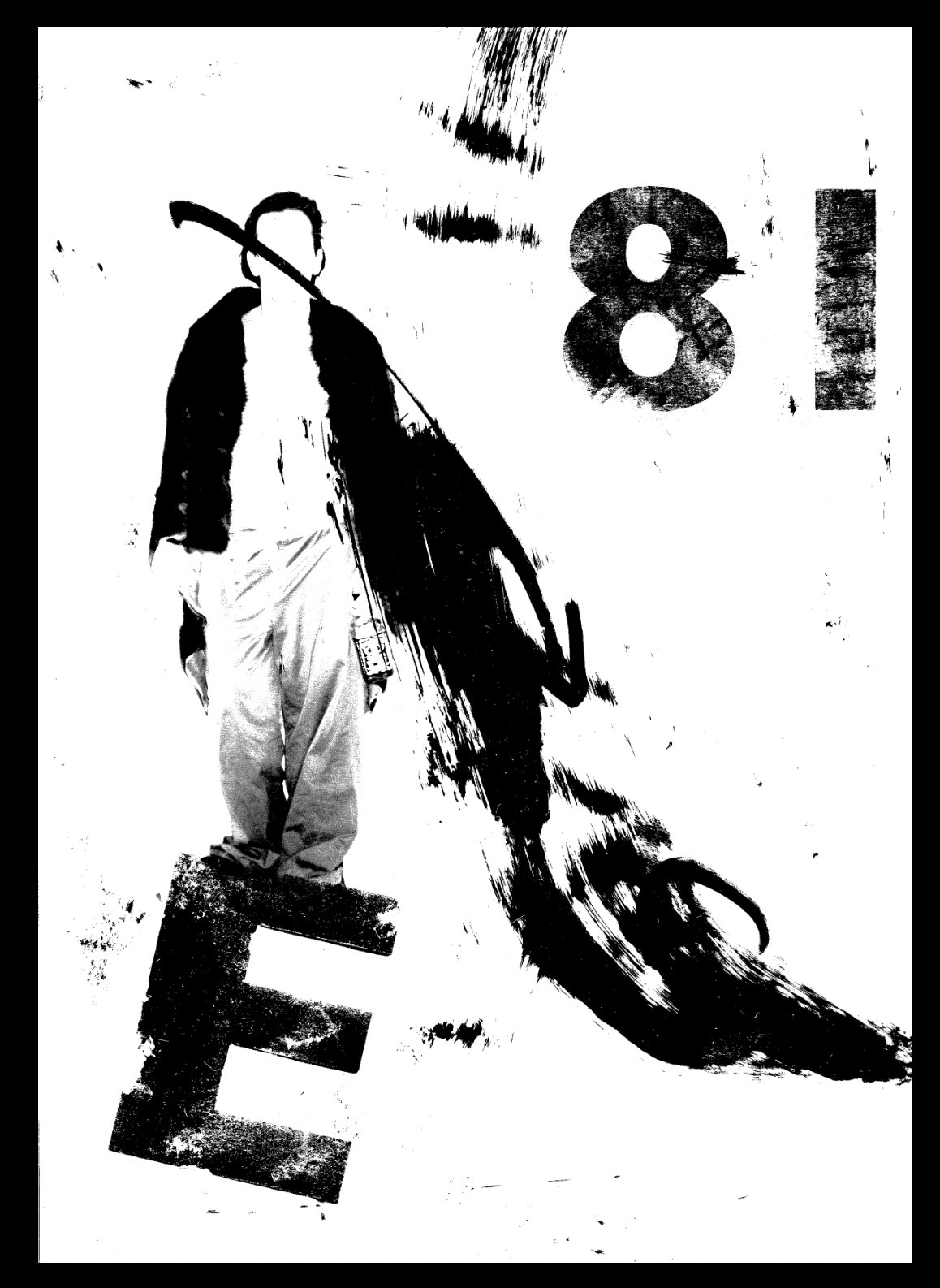
My choice for using these elements was ‘E’ can be for ‘explore’, ‘enormous’ or empty space and the 18 can be the year it was based. I wanted to represent my highlighted words (agitated, mysterious, forgotten, hitherto) through the physical appearance of the letters and numbers. I used a scalpel to cut out and distress the letter ‘E’ and used an acetone transfer method to print the numbers 18. I then placed them with the painterly elements (which intended to show motion and and incident occurring) onto the scanner and began experimenting with different compositions/orders of layers. Above were the most interesting results. I then went onto editing the images threshold, creating a pure black and white version. I added an image which I felt could add to the emotion of the text (exploration or sense of emptiness). I decided to use a blue for the end result to refer to the sea and everything representative of this. This could potentially work as a screen print, which could be something I try when designing my ‘bad typography’ book.
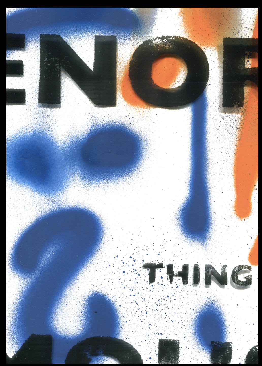
Particularly inspired by this piece by Villegle I decided to test with a spray painted element of type. I used a blue and an orange spray paint to write the numbers ‘1866’. Villegle’s use of collage is excellent and made me look at some ripped posters I had collected previously and more recently find more from the outside of pubs and bars local to me.
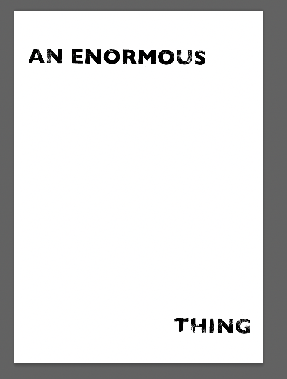
I printed out the text and used an acetone transfer method to give it a more distressed look. I experimented with the size of the type digitally before printing it out onto acetate. I made the word ‘enormous’ literally enormous in comparison to the rest of the text. I thought this was obvious, but could be effective.
These results were interesting but seemed incomplete or more empty than I had of hoped. I continued to digitally edit them, and reprinted the image on the right onto acetate and then rescanned it using other elements.
I wanted there to be a synergy between the physical and digital techniques used in response to the extract and for it to be hard to distinguish which elements were made by hand and which were digital. I found that the more layers I used, the more interesting the composition became. It also appeared more ‘agitated’ and ‘mysterious’ as the extract describes.


