Creative Book Design- Part Four: Altered books -Exercise 3: Sequencing Images
In this exercise you’re going to create images which you’ll then print onto the papers you collected in the first exercise. You have been working with the poem Tango With Cows in the exercise ‘Concrete Poetry’, to create an experimental text. Using your interpretation of the poem as a starting point, develop a set of images that you can sequence into a narrative. You can choose to create these images yourself or use existing images.
To begin this task I researched and collated some mood boards of various artists/artist books to refer to. I wanted to have diverse reference points, from Mike Mcquade (Illustrator) to Julian Schnabel (Abstract Expressionist). I also continued adding to my list of related words to the poem from the previous task which was a good starting point.
I wanted to establish the folding method I would choose to create my initial double sided book. I liked the idea of a more interesting/complex folding method as I feel it would represent ‘Tango with cows’ well. I began more simply testing with an accordion fold, eventually seeing how interesting I could make the folding method. The idea of the book standing up as more of an installation interested me as I wanted to create an almost ‘bridge’ as the poem mentions/represents.
I used copy paper to test with layouts keeping within the parameters of a 16 page folding book. I wanted to represent the more nihilistic sense of the poem, as well as the divide in cultures it describes. I quite like the ‘T’ shape as it is explicitly ‘T’ for Tango, but the shape also represents the 2 cultures with a bridge or the crossover between them.
This shape has a few functional problems. The design couldn’t be viewed as a sculpture as I initially thought could work well, unless it was strung upright. The viewing of the book is also an issue as the pages wouldn’t be in an obvious order for unfolding/turning the pages. This order/method of folding is something I would have to work out. The more ‘random’ order/way of viewing the imagery could work well as it aligns with the context of the time the poem was written, where nothing was concrete and revolution was close.
I came across this image in a vogue book. I really liked the close up portrait and felt that it represented the bourgeois Kamensky references, in particular the hat. Looking back at one of my thumbnails I wanted to remove the characters eyes and ‘vision’ to show looking past class and making improvements (bridging the gap) or/and to represent a more negative view of being blind to or not caring about the disenfranchised.
I noted down some ideas referring to my list of words/ideas from the previous task. I created some very rough thumbnail sketches to gather ideas for composition. I then went onto sourcing imagery to use and decided to look for juxtaposing styles: city buildings, flowers etc.
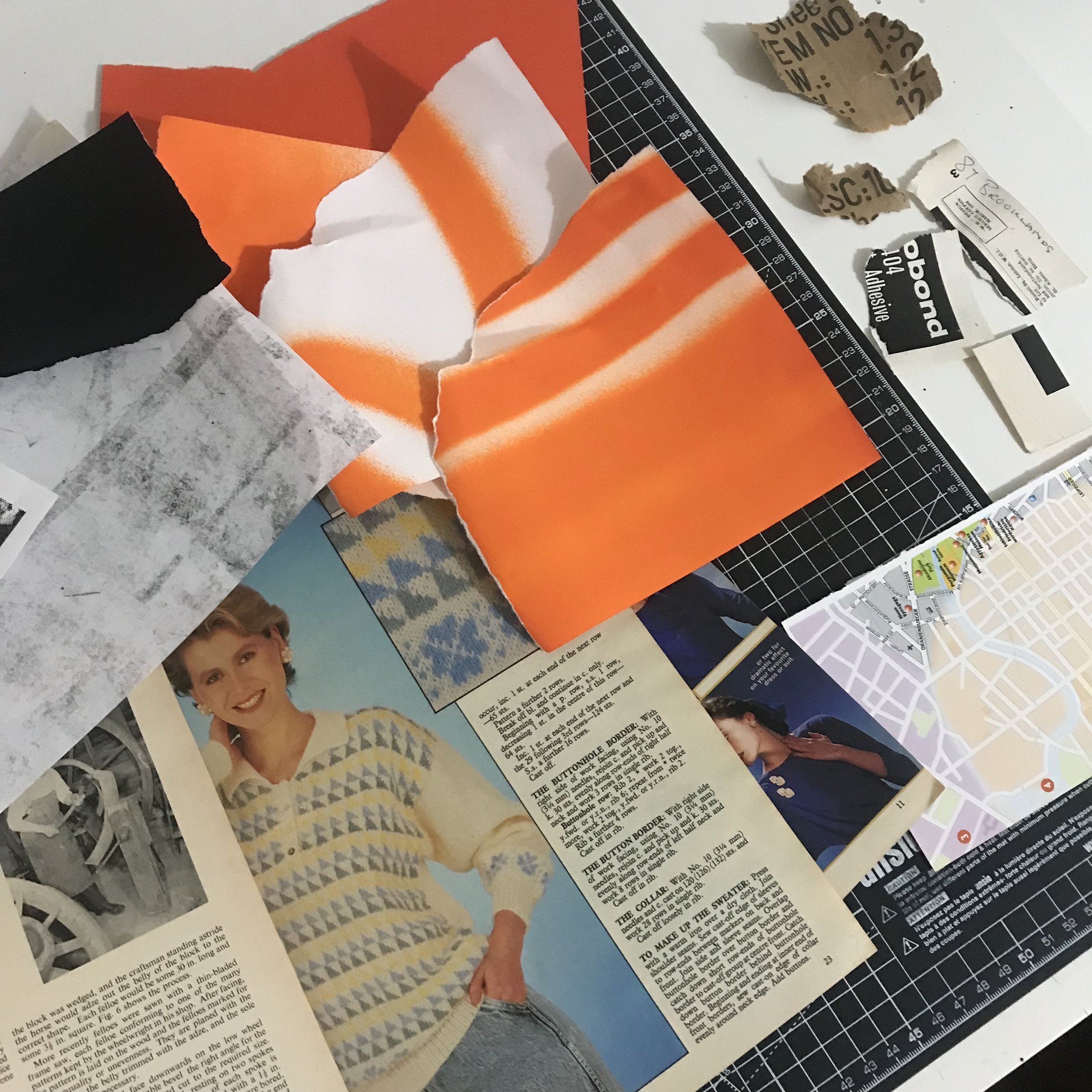
I chose to use a limited colour palette as this task is quite open and I work better with slight restrictions. I decided on an old/aged paper and orange- ‘Kings of orange groves’ a particularly interesting line from the poem.
I wanted to create a juxtaposing image with the complicated feel of the technical drawing and spray painted words. I created various backgrounds and tested with scanning them in, covering them with the words ‘tango’ printed onto acetate. I came across this method in a previous task, which I enjoy as it renders more ‘random’ results.
My intention for the technical image with simple words over the top was to present and ‘bridge’ the gap between classes/cultures as Kamensky creates with his words.
I laid out some images I took from various old magazines from the 60’s to 80’s along with some handmade paper textures made with different materials including spray paint. Still keeping within my chosen colour palette I began to collage and create visuals hopefully with an energy that emulated the poem.
I combined digitally edited images re-printed with acteone transfers, paint, various pens/pencils and distressed some of the images using tape. I later tested with digitally editing my images which gave me the idea to have 2 elements of the book. One will be more tactile collages, the other being bold black and white graphics, finished digitally. I feel like this could represent the class system Kamensky represents in ‘Tango with cows’.
I liked the idea of eyes representing people, emotion and referring to ‘crimson tears’. The previous more sinister image inspired me to test with this further. I played with pairing a portrait with other images (looking back at Villegle’s use of portraits and close ups of eyes from my mood board).
I liked this image and felt it represented the bourgeoise well. The further I experimented with size/composition, the more I felt the image worked. The final image is not explicit in what it represents, but I feel that the dark close up of the face has an eerie feel as if they are looking down at you.
I decided to use an acteone transfer method to print the image, afterwards scanning it and digitally editing. I also edited some other found images, adding some handwritten text with a marker that was nearly running out. I quite liked the result of the text and felt that it could represent the anti-moderism ideas Kamensky represents in the poem.
Instead of loading the images into Indesign to decide on my layout I wanted to do it physically so I could get a feel of how the double sided pages would work. I went onto testing with each image and debated either reprinting it double sided, or sticking them together after deciding on the final layout.
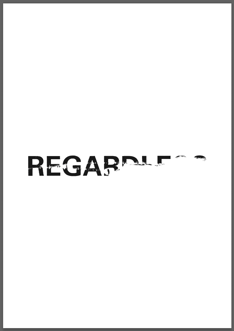
I chose one word from the poem that I felt could evoke strong alternative meanings. The definitions for regardless being:
Despite the prevailing circumstances.
"they were determined to carry on regardless"
Without regard or consideration for.
"the allowance is paid regardless of age or income"
I distressed the type using tape and by dragging various sharp items across the page, also burning the bottom word. I liked the focus on ‘less’ literally being lessened by being ripped.
For my final layout, I decided to sew the pages in each corner and connect them together in this ‘T’ shaped layout. The ‘T’ shape as explored at the beginning of this task I feel is well suited to the context of the poem.
A downside about this choice of binding is the holes left on the images. Perhaps this could have been remedied by adding a gap between the images and the holes, but this could be less aesthetically pleasing than the holes itself.
I chose a white cotton in an attempt to not draw attention to the binding, but looking back I feel as if an orange would have worked really well and could tie into the context of the poem instead of being just a method to bind the pages together.
Further Reflection:
During a conversation with my tutor we reflected on this section and discussed further potential outcomes if the physical book itself was focused on as an initial voice itself for it’s content. We then decided it could be good to go back to this section and test the difference in outcomes if I used an orange cotton to bind the book together as previously mentioned.
It is harder to display with images, but the orange cotton used worked way better. It felt as if it brought the whole design together and allowed the black/white images to be more obviously connected to those of colour. I again quite liked it’s tactile appearance and the orange cotton only exaggerated this.
The ‘raw’ edges of paper and the fact that there is no spine/cover concealing the designs or 'completing the book became more obvious to me looking back and adding the orange cotton. Perhaps a different method of binding would’ve been more effective? I look forward to continuing testing with future tasks.


