Creative Book Design- Part Five: Production -Exercise 4: Printing
In this exercise you can use any images created elsewhere in the course, to print onto the paper samples you collected earlier.
When you’ve created a set of images, scan or photograph these to create digital files – JPEGS or TIFFs on your computer. Make sure the resolution is set at 300dpi. Having gathered all the images together in one folder, consider how you’re going to print them. What order will the images appear in? At what size? How will the image appear on the page? Which paper will you use for which image? Do you have a particular image in mind for a particular piece of paper? Will you try printing the same image on different sheets of paper?
I have various, ever growing folders of interesting images, textures, designs and random photos that I refer to when making new work. For this task I collated some interesting screen-printed designs from various independent designers found via social media.
I decided moving forwards into this task from E2 and E3 that I want to focus on alternative meanings of objects and imagery, using the word ‘mundane’ as a focal point.
I began this exercise by collating some inspiration into mood boards for me to reference. I wanted to produce some new work to print (and potentially use to screen-print for my final book) so took this task as an opportunity to do so.
The type of paper used, especially with screen-printing matters. If the surface is too rough, a different more jagged result happens, if it is too smooth or has a glossy layer, this can cause it to stick to the screen and rip the paper/leave a rough texture to the print.
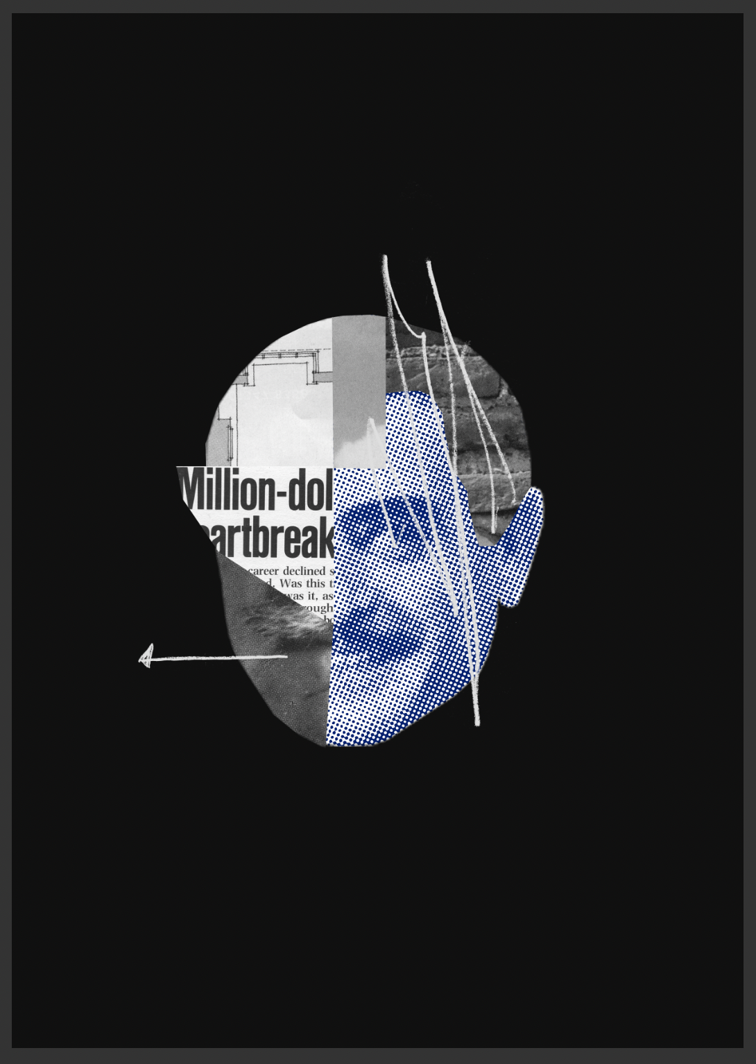
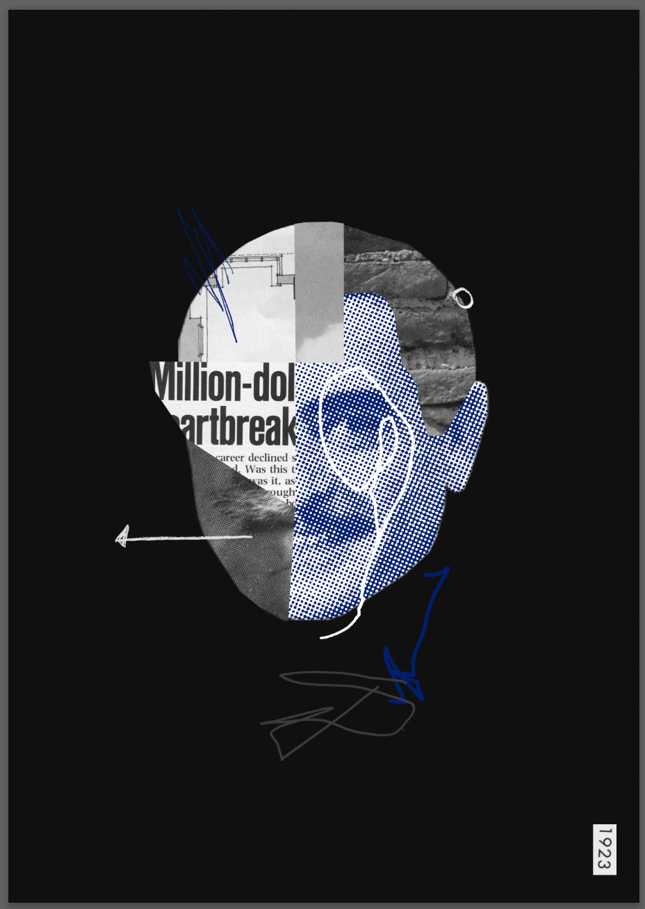
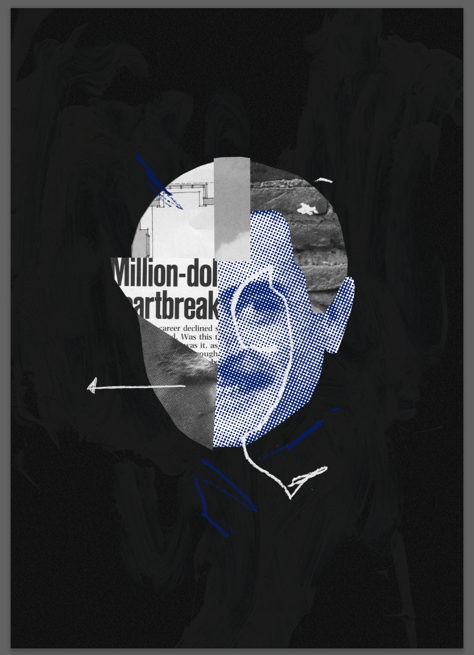
With this initial design I wanted to create a collage to scan/print using a xerox printer. The idea behind the collage was to show a feeling of the mundane which I felt was a ‘void’. Something that is ‘mundane’ lacks interest or excitement and the word that represented this for me was ‘void’. I started by creating various textures using different materials such as spray paint, pens, chalk and pastels. I then layered these using a portrait of a man who almost looked distressed. I wasn’t very pleased with the outcome of my collage and continued with testing further.
I went onto using the word ‘run’ to contrast the meaning of ‘void’. I chose the typeface Univers and printed it off to distress it using tape and a scalpel. When using the tape I found that the word came off and stuck onto the tape which looked interesting. I placed them both into Photoshop and adjusted the threshold ready for a potential screen-print.
I quite liked the outcome of this and it could work well as a screen-print, also representing the feeling of the mundane, the wearing away of your mind by doing day to day boring activities.
I looked through various old books/magazines I have and came across this image of people playing poker in a 1970’s magazine. The faces of the individuals interested me the most, each looking slightly different, some enjoying themselves and others more concerned or bored. I wanted to see if by taking the faces out of context different meanings could be evoked from the same portraits. I collaged them together creating one image and continued to cut them up within Photoshop producing different outcomes.
The final image in black and white could work well as a screen-print, or I could potentially do a 2 coloured print and see how that turns out.
Overall I felt that the final image looked quite flat and perhaps needed more layers. Nevertheless this was an enjoyable method of digitally collaging that I hadn’t tried in this way before.
When printing the image firstly on 110gsm paper and secondly on normal A4 copy paper, the texture was better on the first and the laser print (especially black) seemed more full.
On one of the prints I accidentally printed it zoomed in, I quite liked the end result (shown on 110gsm paper).
I went onto printing this through both a xerox and an image printer. Surprisingly I preferred the result of the second image on the xerox printer. It is hard to show via the image but the texture of the black was less sharp, adding to the image. I also printed a zoomed in version inspired by my previous printing mistake.
Inspired by Mimmo Rotella’s ripped portraits from my mood board I bought some blank printable stickers and printed an A5 image of the portrait. I distressed it using tape, a scalpel and my hands, adding a very small amount of brown ink to make it appear used/worn.
Moving onto my next design I again to present ‘mundane’ through portraits. Inspired by Rotella and Mcquade’s collage work I began to look through various aged magazines from the 70’s-90’s and used different portraits to create a face.
I wanted to continue with digital collaging and referenced the screen-printed T-shirt mood board in particular when designing this. I also chose a square canvas which I haven’t worked on before to test different potential shapes for my final book.
I used some found imagery from Malcom Garrett’s Instagram to create my next design. I was particularly inspired by Garrett’s use of imagery and the emotive nature of them.
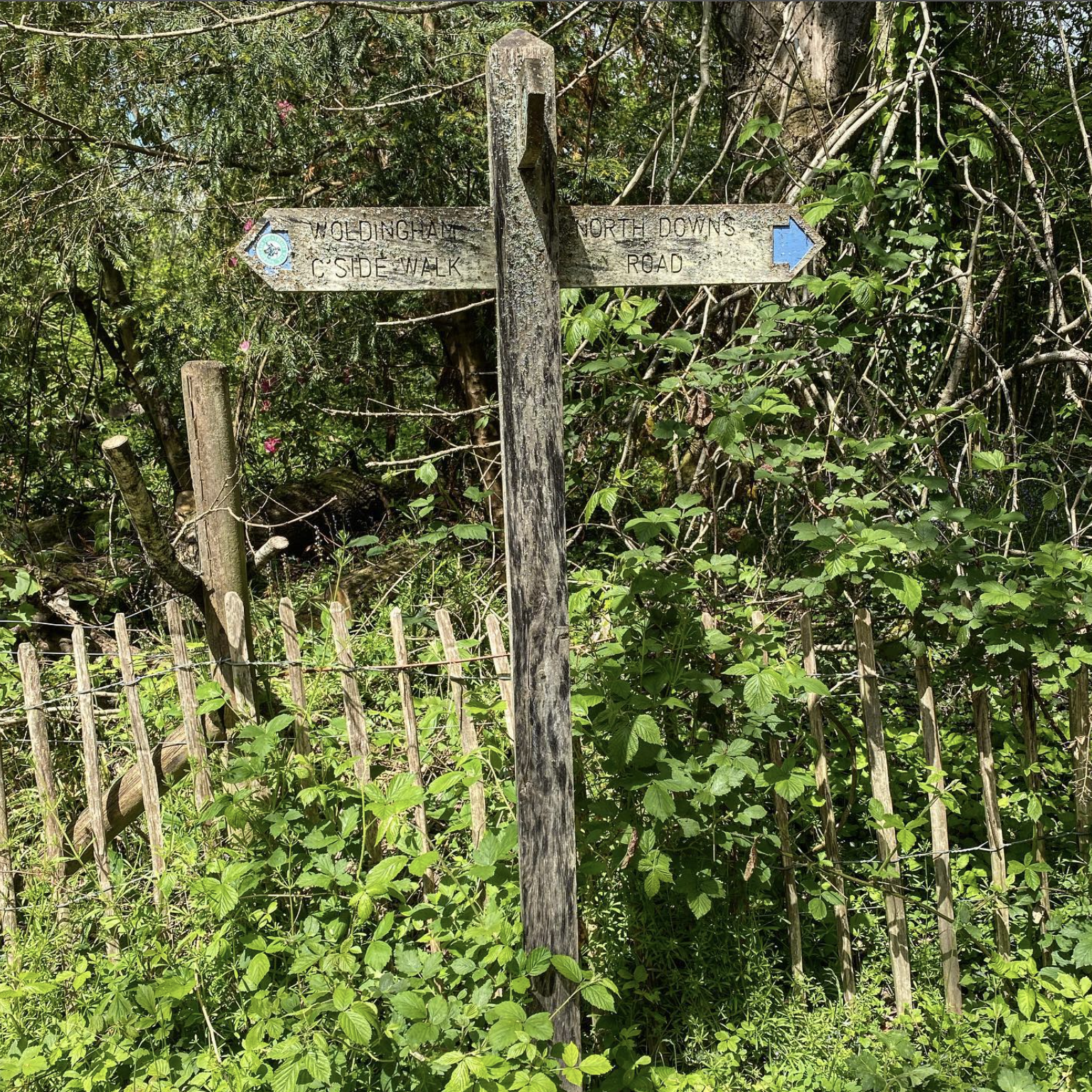
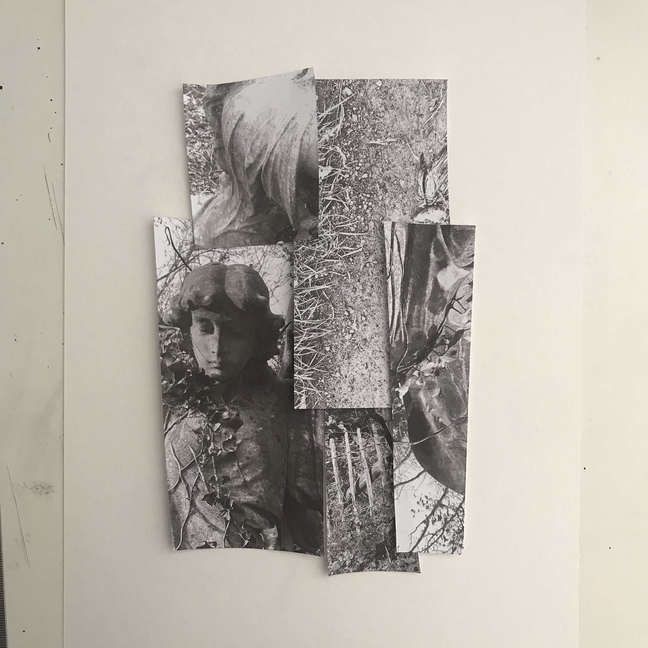
The crucifix shaped directions sign is full of metaphors; life, death, religion, nature, direction in life etc. I paired this with 2 images of concrete angelic figures and one which is less appealing of a dead bird. The relationship between these ‘random’ images was so interesting to me. The bird is dead but it’s wings are preserved, the angels have wings but are concrete and the directions sign points in all directions. I began by collaging the images digitally and then physically. Finally I created a few screen-prints of the outcome.
I quite liked the outcome but felt that I should of made the image smaller to allow for more negative space. I liked the brown paper outcome, the crinkled texture gave the print more depth. The tin foil I thought may work but I think that the gloss on top of it prevented the acrylic mix from sticking.


