Creative Book Design- Exercise 5: Research and development
Firstly, review your visual ideas based on from the previous exercise through a process of critical evaluation. Which ideas are you drawn to? Which ideas have ‘legs’ – possible interesting outcomes which are worth pursuing? Often the ideas which are strongest are those which have depth, or many layers of association. Perhaps you are intuitively drawn to a particular idea. Select a few ideas you would like to push further. Use your learning log to record your thoughts.
Now, do you need to undertake any research to help move your selected ideas on? The form your research will take depends on the individual elements of your idea. Find source material that helps informs your ideas. For example, by doing objective drawings or taking photographs, to understand your subject better, and to consider aspects of composition. You can use both primary and secondary sources of research in this way. Research feeds into the development of your visual work, informing and advancing your ideas. Document this phase of the work accordingly.
The developing your ideas stage is about building on your initial ideas by reworking them, adding the visual or other insights gathered through your research, and testing out different versions or possibilities. Spend 45 minutes developing the possibilities of one of your ideas. How many different ways can you visualise this?
If you want to develop a broader range of ideas, then repeat the previous exercise to generate more possibilities, potentially using a different phrase as a starting point. Use your learning log to document this process of review, research and development.
Visualising your ideas is the culmination of all your preliminary work in which you work up some more developed visual sketches and ideas. This artwork can be hand-drawn illustrations, photographs, and/or include typography. The presentation can be a little rough around the edges but should show the main elements of your designs. Select the strongest variation of your ideas from the previous research and development exercise to start exploring how you can visualise them within a mock-up.
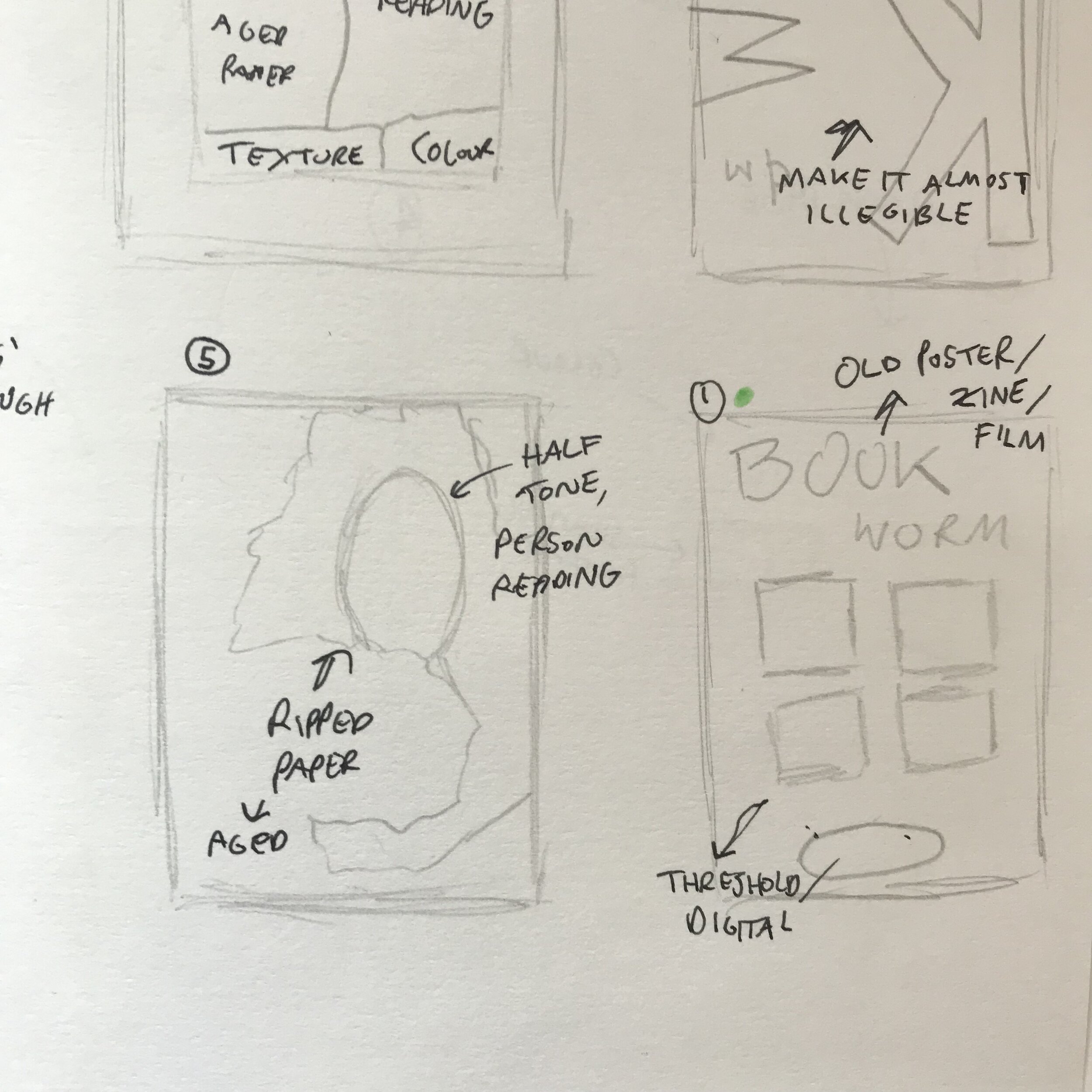
I began this task by identifying the thumbnails that I felt had potential, marking them green. These decisions were based off of the ideas behind the thumbnails rather than visuals I had in mind. I found that these thumbnails/ideas could have multiple layers of meaning and create interesting visuals.
When looking through my ever growing folders for visual inspiration I came across an interesting typography composition (the bottom left of the mood board.) I was unaware of who this was by initially, but after some research I found it was by Hendrick Nicolaas Werkman. I went onto looking into him and his work some more. He was a dutch artist and printmaker and from 1923 to 1926, he produced his own magazine called ‘The Next Call.’ This was very interesting, and some of the images I had saved were from this magazine!
In 1940 after the German invasion of the Netherlands Werkman started a secret publishing house, included in them were many Hassidic stories. The Gestapo arrested and executed Werkman along with 9 others 3 days before Groningen was liberated.
The compositions, textures and colours Werkman used are very interesting. I really like the minimal cover for his magazine, it is simple, textured and includes the red colour repeatedly used within his work.
I found the time limits helpful for this task as it forces you to think quickly and to not have time to be overcritical. Creating a mind map and adding to it throughout designing some thumbnail sketches helped a lot.
Again I highlighted the thumbnail sketch I would refer to with a green dot. I had an idea of the types of imagery I wanted to use, potentially one of the same or similar person.
I went to ‘The Human Figure’ a book I came across a long time ago to draw from. The imagery inside is of various models in different poses.
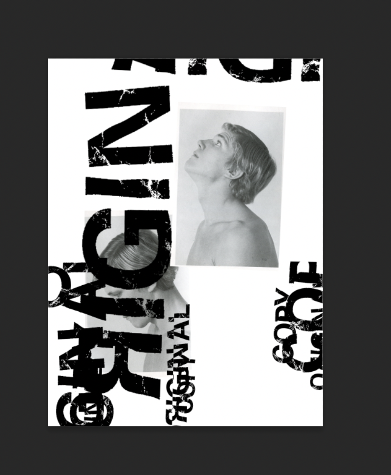
I then tested with using the blur tool, and ended up blurring the text completely to create a shadow texture.
I added in the text in the bottom left ‘original copy…’ to exaggerate the oxymoron and following it is some text from the bottom of a receipt. I liked this addition to the narrative of a narcissistic postmodern ‘everything’s pointless’ view. The text is very robotic and is copied from receipt to receipt. The lighter edited image is looking down towards it, again showing mixed ‘good’ and ‘bad’ feelings towards the text (books.)
The negative space around the edge represents a void, or space for thought/opinion. The uncared for dirty paper texture is to show the lack of care some people have for books, peoples thoughts etc.
The overall aesthetic of this design was inspired by viewing some of the zines on 1991 Books from my research.
‘You can’t judge a book by it’s cover’ a true phrase I hoped I could design something interesting displaying the phrases layers of meaning.
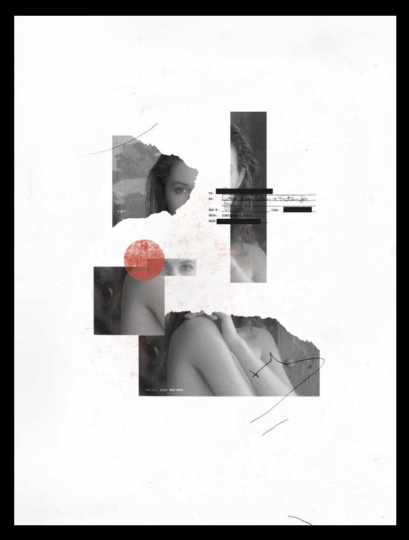
I looked through my folders of pre scanned images and headed to one of a model, a potential ‘cover’ photo. The ripped, collage aesthetic shows confusion and the multiple parts of a person. I wanted to focus on the eyes (‘beauty is in the eyes of the beholder’) because they represent judgement positive or negative.
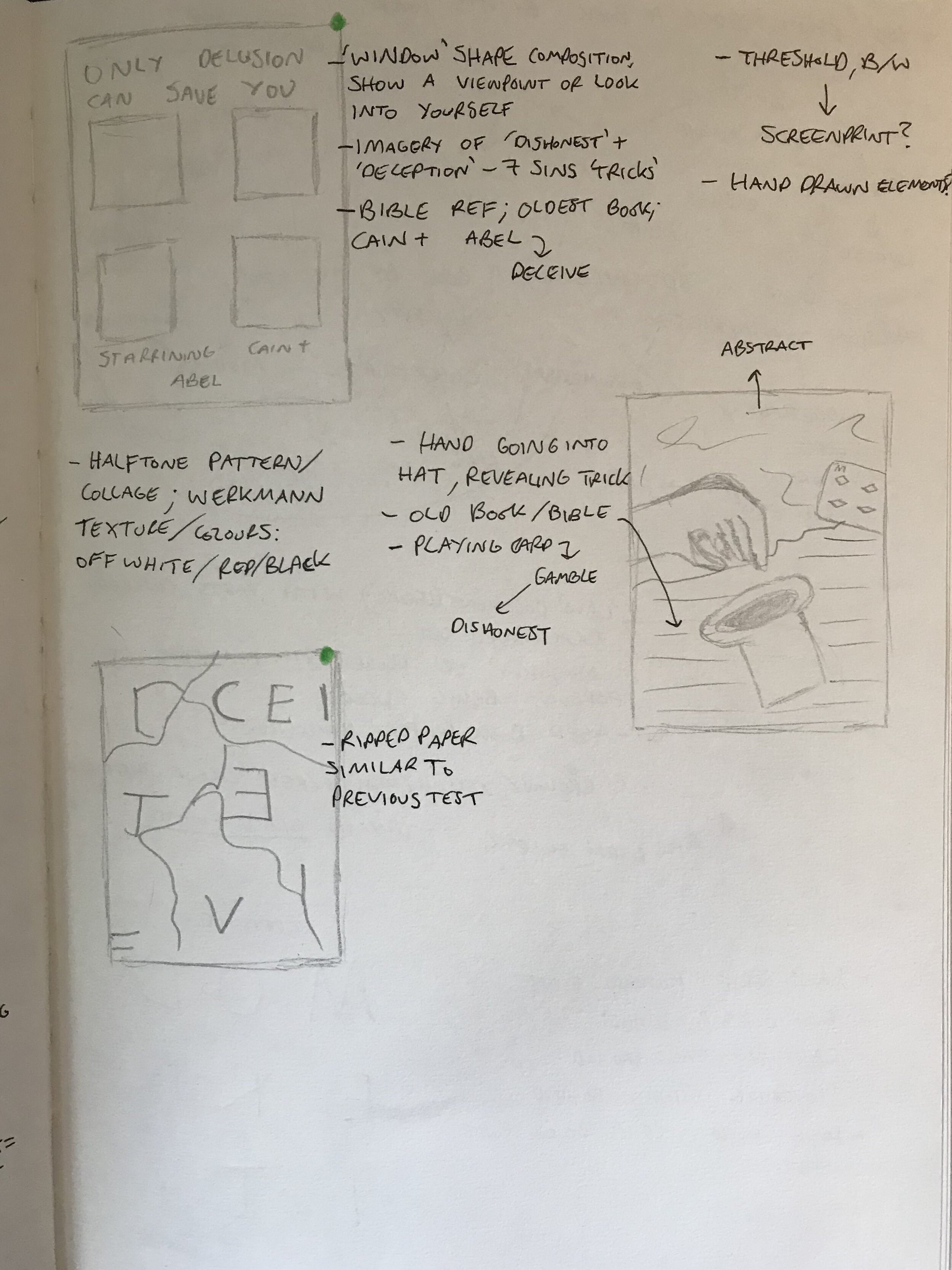
The next design was quite an abstract idea from the original quote ‘Oldest trick in the book.’ I wanted to present this in a ‘grunge’ old fan zine style aesthetic.
In my mind map I mentioned the bible and stories I knew from it, this being arguably ‘the oldest book’ to people of certain beliefs. I chose to represent the story of Cain and Abel showing ‘tricks’ and ‘dishonesty.’
I chose imagery from old books and movie magazines that represented ‘7 sins’ or temptation for something ‘evil.’ This to me represented ‘the oldest trick in the book’ being humans temptation for bad or negative thoughts/actions.
1991 Books is a publisher of zines and photo books by different artists, designers and photographers. I have been following them on Instagram for a while, and took a deeper look into the artists work they published. The one that I found particularly inspiring was a zine by Seth Fountain, an American artist.
I liked the tactile feel of the zine, in particular the hand written/drawn elements. This also provides me with inspiration when thinking about the layout of my final zine.
I jotted down words that related to good/bad books and continued with my extensions of thought from that subject by drawing arrows between them. Although these plans are very messy, they were massively helpful to me in developing ideas before designing them.
I wanted to present ‘Good and bad books’ as a dual narrative rather than focusing on either or.
The darker image represents the ‘bad’ and the lighter image the ‘good.’ The darker image is facing upwards, which is a positive posture and counterintuitive to the dark colour and the ‘bad’ it represents. The lighter image is the opposite, with his head facing downwards. I liked this idea of an oxymoron as it shows the importance of perspective when being the ‘judge’ of a book. Some peoples ‘bad’ is another’s ‘good.’ This also speaks to the broader narrative of judgement.
Inspired by my other typography tests I wanted to continue along that path and played around within Photoshop using the phrase ‘original copy’ inspired by my mind map. I created a distressed typeface by printing out the letters/glyphs and scrunching/scratching the paper.
I included some text from a found image from some sort of old American legal document. I liked the typography here and wanted to again show ‘judgement’ (judge in law) using this style of typography.
Inspired by Werkman’s work, story and use of red, I feel like red distressed circle can add another layer of meaning. Red is quite a violent colour and splattered behind/on front of the collage makes it look less aesthetically pleasing and could present how judgement/pre judging rips people apart or creates false narratives.
The composition of this was inspired by 80s/90s club/rave xerox posters and the work of Jamie Reid.
I decided to screen print this design to add texture to it physically. Taking an image of the printed version and editing away the white created an interesting result.
A lot of the distressing created digitally didn’t show up due to the paper I used, but overall I am relatively happy with the result.


