Core Concepts- Exercise 24: The French Hen
Newton and Ridley, the brewers best known for their pub, The Rovers Return, are opening a cafe/wine bar nearer the city centre.
The bar is designed to appeal to younger women and sophisticated young men. The brewery has identified a gap in the market and wants to provide a ’sophisticated and relaxed’ venue for the ‘discerning’ drinker. This bar is to be called the French Hen and will be in direct competition with the cheap ‘binge drinking’ venues on the same street. The brewery is also trying to enhance its own image as a ‘respectable’ alcohol vendor.
They want you to develop some ideas for a logo, to be used:
• on covers for the food and cocktail menus
• in colour on the signage outside, and as a cutout for a window detail
• on T-shirts for the staff and paper napkins
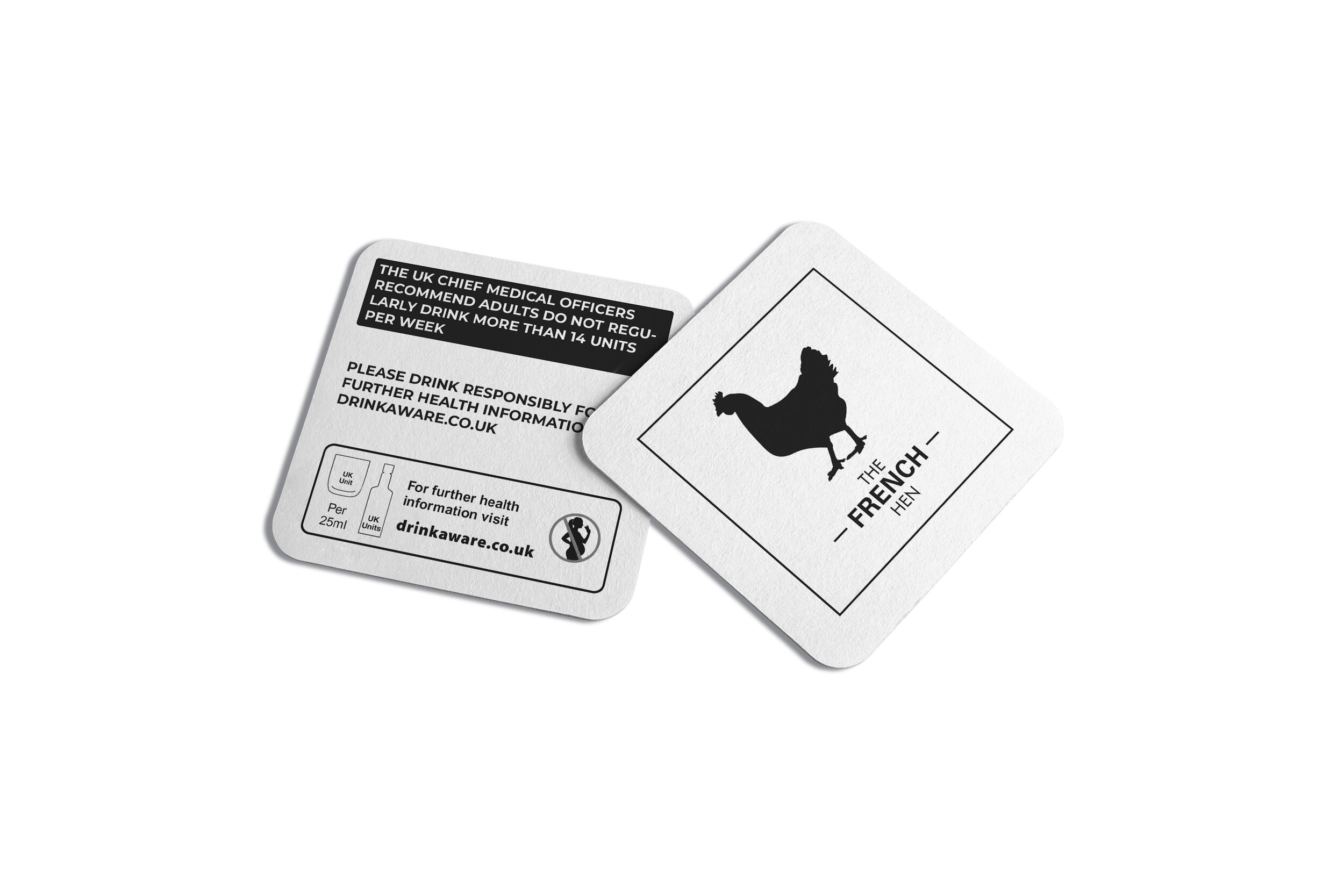
• for one side of a beermat, the other will carry advice on sensible drinking.
There are many conventions that have been developed around the marketing of both bars and products to this age range. You need to be conscious the whole time of avoiding clichés and stereotyping.
Draw up at least three ideas to start with. Be critical of your work. Check it against the information you have here. Will it do what the client wants – and how will you know?
When you have decided which one you are happiest with, mock up the menu covers, the outside sign, the window detail, a T-shirt, paper napkin and beermat. Does it all still work?


A common theme between these bars, were the colour and style of logo. The black, white or/and gold show sophistication, all of the logos are minimal and use simple imagery or shapes. All of the bars/restaurants vary in font style, some choosing a serif font and others a sans serif font. This is interesting as I feel that they still appeal to the same audience, but the ones using a serif font appear older (deliberately) but with that comes a sophistication in itself.
The obvious iconography to use for ‘The French Hen’ is a chicken. Other imagery that comes to mind is; France, French flag, stereotypical French foods, glasses, handshakes.
I jotted some ideas to reference when designing the logos. Simple shapes were a key factor throughout the logos found in my research, which would give across a sense of sophistication but be relaxed?
The fonts I felt work well together were Helvetica Neue Light, and Univers Bold, I liked the contrast of the thin and bold weights. I continued with testing with the fonts, changing their size and angles. I had to keep in mind the use of the logo, that it must be able to be used across menus, signs and staff uniform, it had to be simple and modern.
Now I had produced a few designs, I needed to introduce colour and see whether this was more affective. Inspired by my research, I decided to test with the use of gold, this gives a sophisticated modern feel.
The initial gold colour I went for was quite yellow, and didn’t look very professional. I changed it to a lighter gold, which was more affective. I also tested with a bronze colour, which I didn’t feel worked as well.
I began by researching Newton and Ridley and was amused at the fact it was a fictitious brewery from Coronation Street! I moved onto researching bars, with a sophisticated feel that appealed to young people.


I researched logos for various businesses, and collated my favourite minimal style designs. I think a minimal style of logo using simple colours or possibly no colour will be affective. This would look sophisticated, modern and appeal to a younger audience.
These logos also used simple imagery, I feel as if simplicity is sometimes best, and in the case of branding or a bar, that this is the case.
I began with the simple idea of a hen. I found an image that was easy to view and obvious that it was a hen, I then used Illustrator to trace the outline, and tested between a silhouette and outlined version. I tested with various font styles, sans serif, serif, bold, thin and then saw whether they were affective when paired with the imagery.
I tested with a more abstract combination of the letters ‘T,F,H’ to see whether this would produce a simple and memorable logo, but I feel as if this wasn’t very affective, at least not as affective as the simple hen imagery.
Between these logos I had to decide which was most affective for the brief. I feel as if the first represents a sophisticated and relaxed cafe/wine bar well. It is simple, the black and white used shows sophistication rather than tacky or pretentious (which the gold could be seen as.) The hen imagery is simple and relates to the name of the cafe/wine bar, it also relates to food, but not so much to drink, which could be an issue. The French Hen must look appealing to young people, which I think this logo would do, the sans serif fonts are easily legible and modern.
I was still unsure how it would appear on the mock ups, and wanted to compare some of the logos properly. I created 2 versions of the mock ups in order to see which was more affective.
Finals:
Coming back and looking at the logos side by side my decision is to go with the black and white logo. The brief was to create a logo for a bar which is sophisticated and relaxed, for the ‘discerning’ drinker. It had to provide a sense of class but remain relaxed, and to me the gold in the logo was too much and could be perceived as pretentious or less of a relaxed atmosphere. I feel like the simple black and white logo using sans serif fonts shows that it is modern, and will attract a younger audience, contending with pubs in the area. The use of the hen rather than a bottle or iconography related to drinking, makes it more appealing to a discerning drinker, and shows that it has class. I feel that the design works well on the mock ups, including in all white as a window detail.
I enjoyed this task and feel as if I have improved slightly from the previous branding exercise. Looking back at my design process I should’ve stopped and maybe redesigned the logo when I became content with it, just to see if it could be improved or modified, perhaps change the fonts used to others I had previously tried, or to a serif style. I feel as if the design could work but lacks a clean and professional feel, I hope to achieve this in the future and it can be improved by working on my process and going back to my designs and reworking them throughout.


